Sandy Ho,
A rigorous yet playful identity for a culinary practice entering a new era.
(Services)Brand IdentityWeb DesignWeb Development
Chef Sandy Ho has been our client since we designed her first book, Cooking Notes Vol, I. While continuing our work on the highly anticipated Vol, II and ahead of her move to New York City, Sandy came to us looking to evolve her broader identity.
As Sandy’s gastronomic practice has grown in recent years, the level of detail and precision has increasingly reached new heights. We knew the new identity needed to meet that shift, and on our first strategy calls joked that this engagement would mark her “major label debut.”
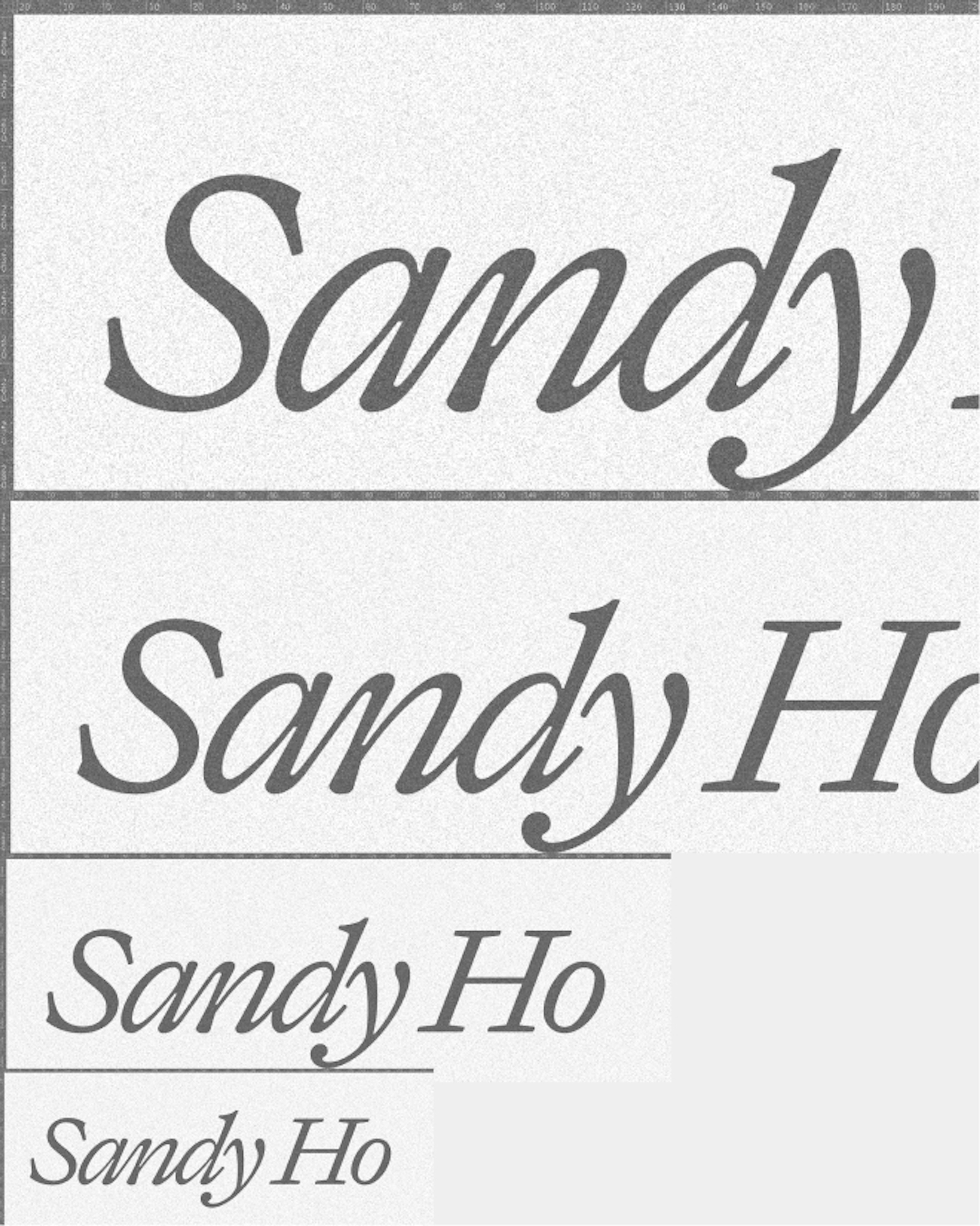
Minimalism with an appetite for play.
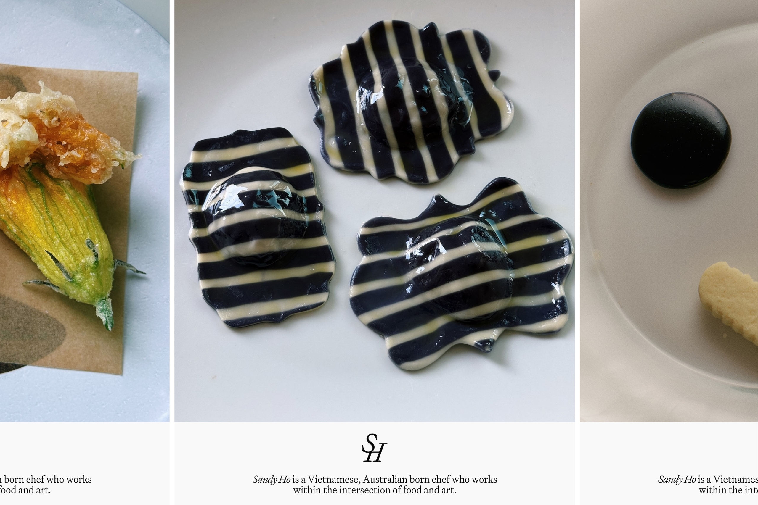


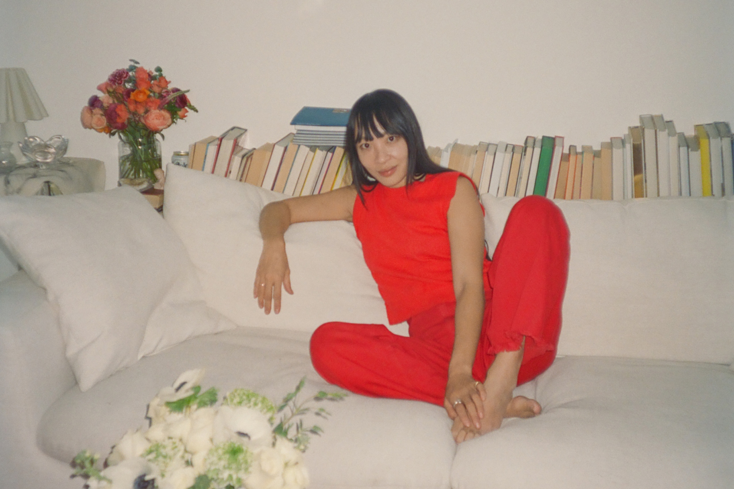
“I am so happy with the final outcome, and the feedback has been incredible.”
Sandy Ho

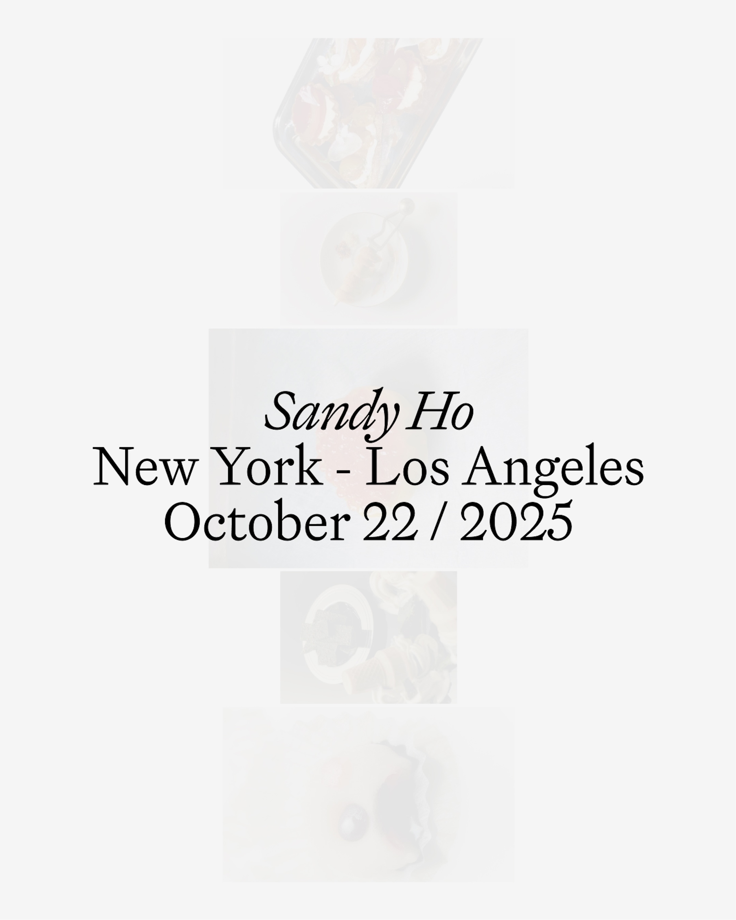
A finer reflection of Sandy’s practice today, with room for what comes next.
Chef Sandy Ho has been our client since we designed her first book, Cooking Notes Vol, I. While continuing our work on the highly anticipated Vol, II and ahead of her move to New York City, Sandy came to us looking to evolve her broader identity.
As Sandy’s gastronomic practice has grown in recent years, the level of detail and precision has increasingly reached new heights. We knew the new identity needed to meet that shift, and on our first strategy calls joked that this engagement would mark her “major label debut.”
Minimalism with an appetite for play.
“I am so happy with the final outcome, and the feedback has been incredible.”
Sandy Ho
Chef & Author
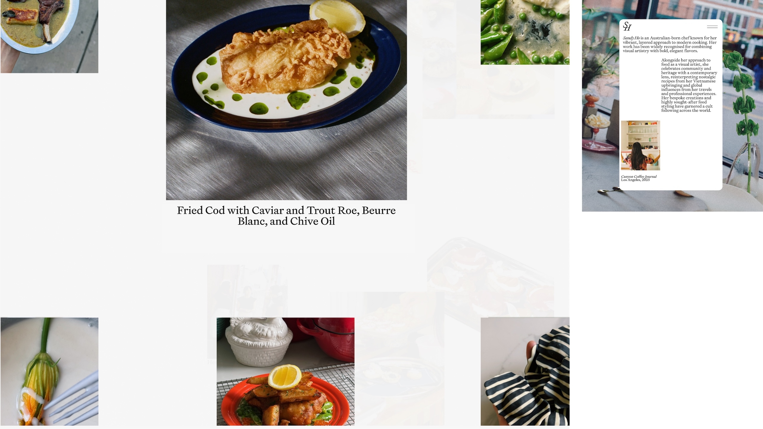
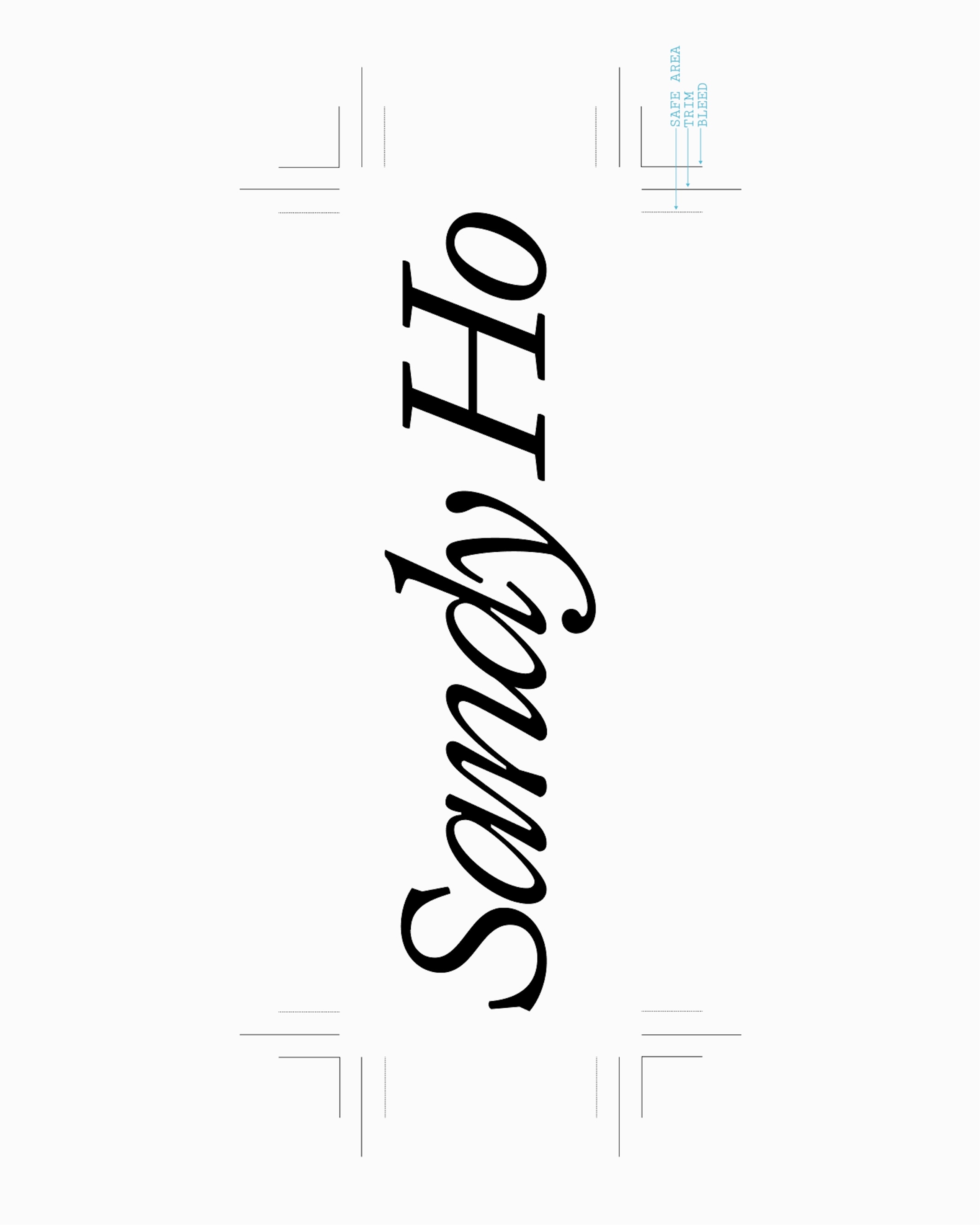
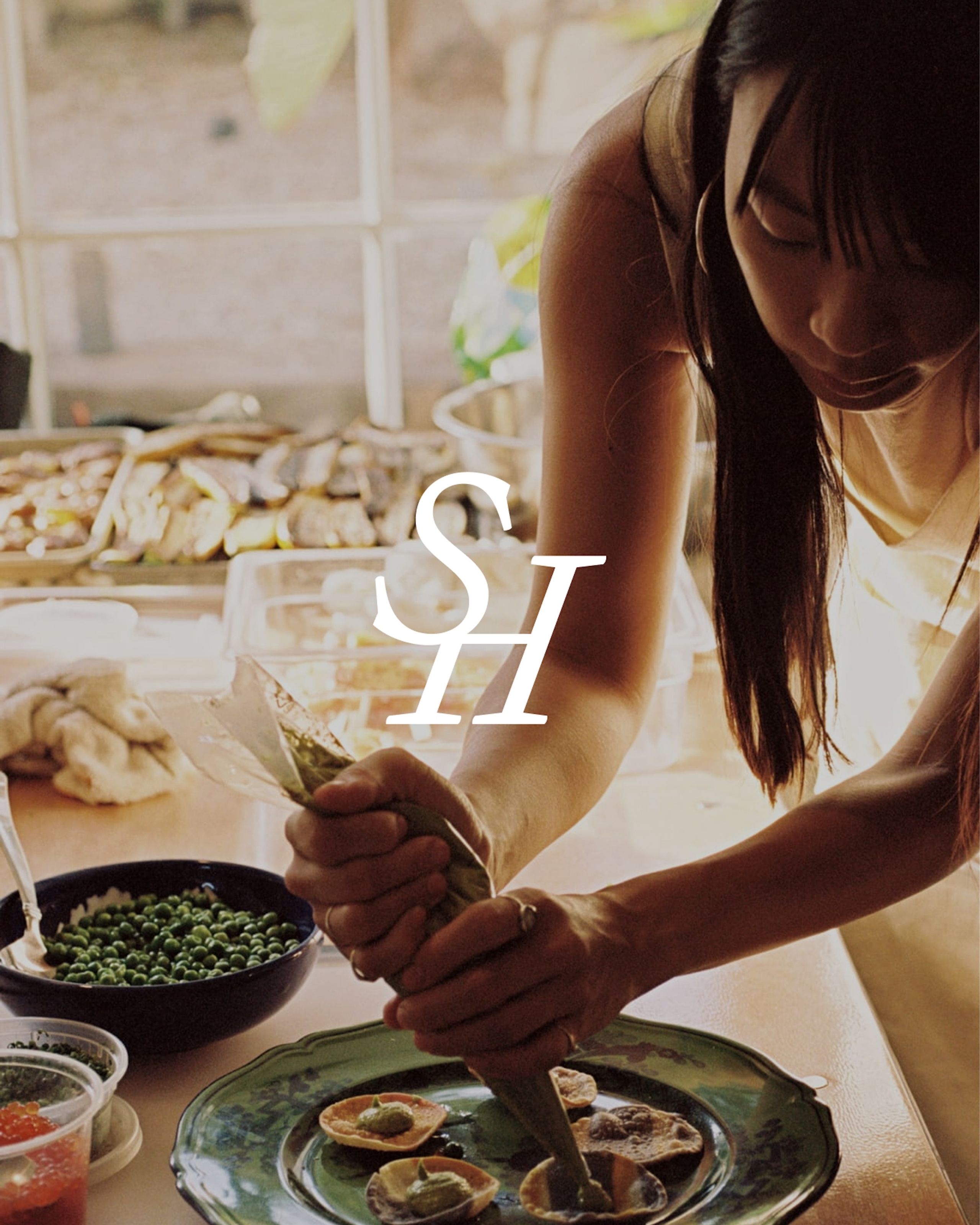
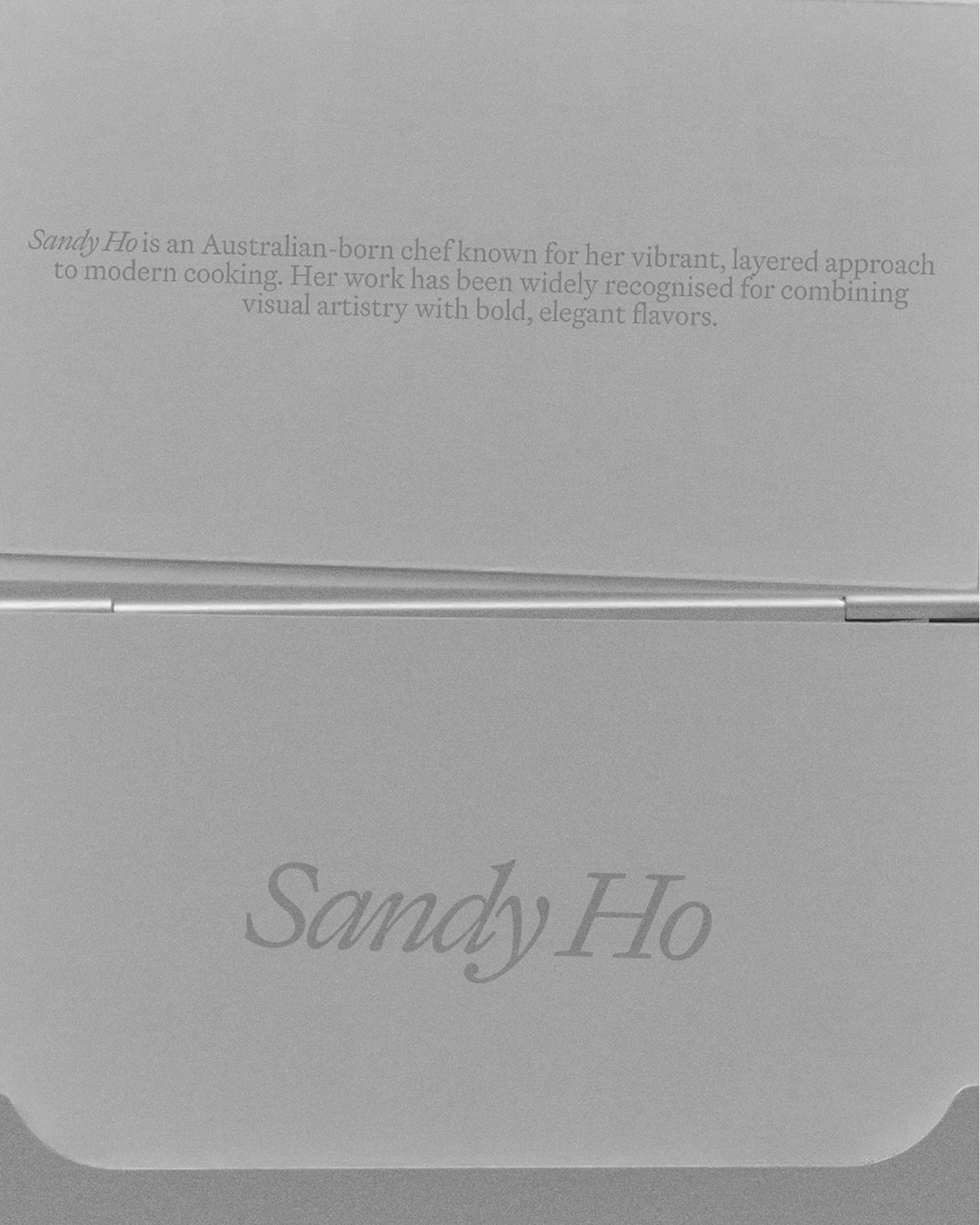
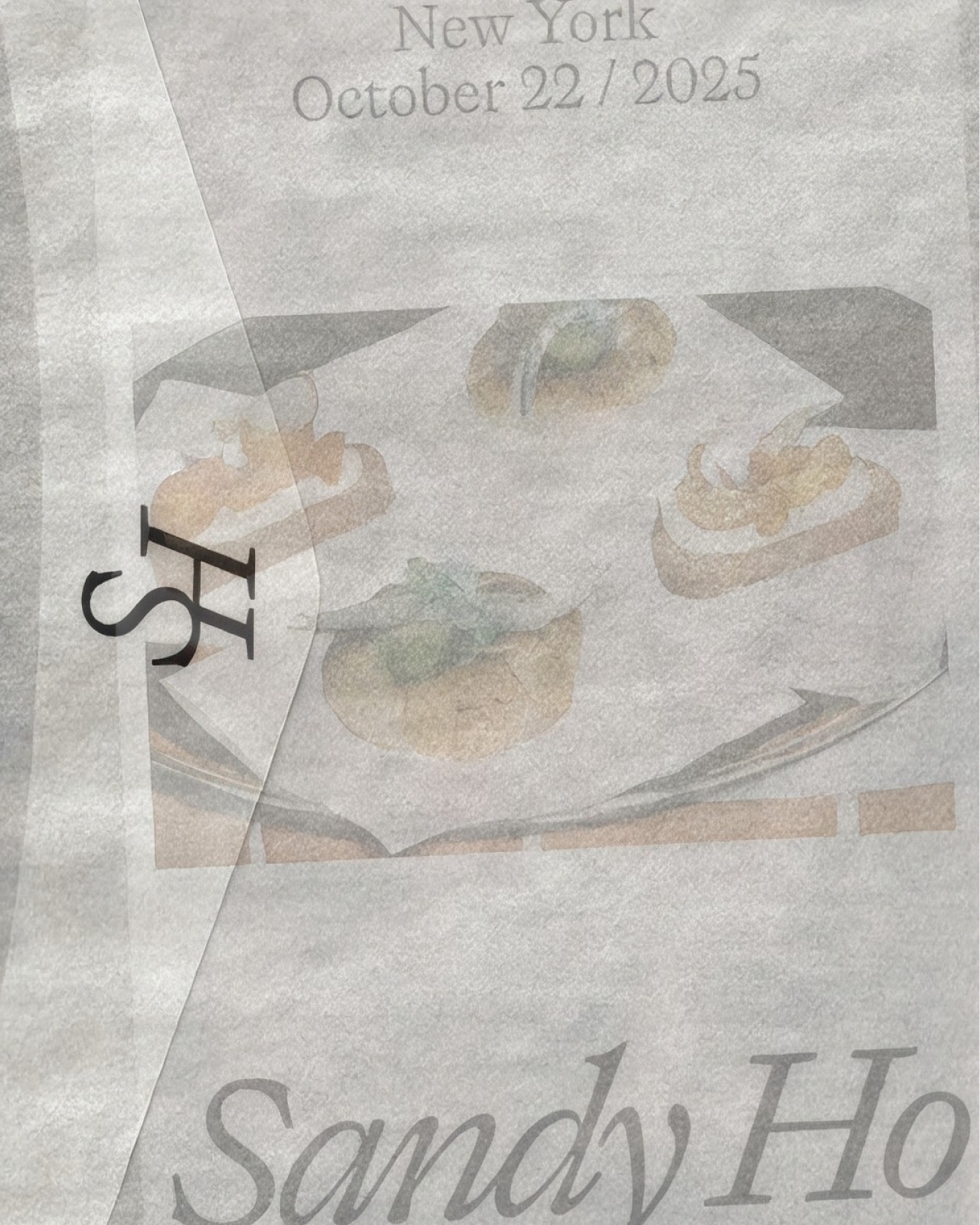
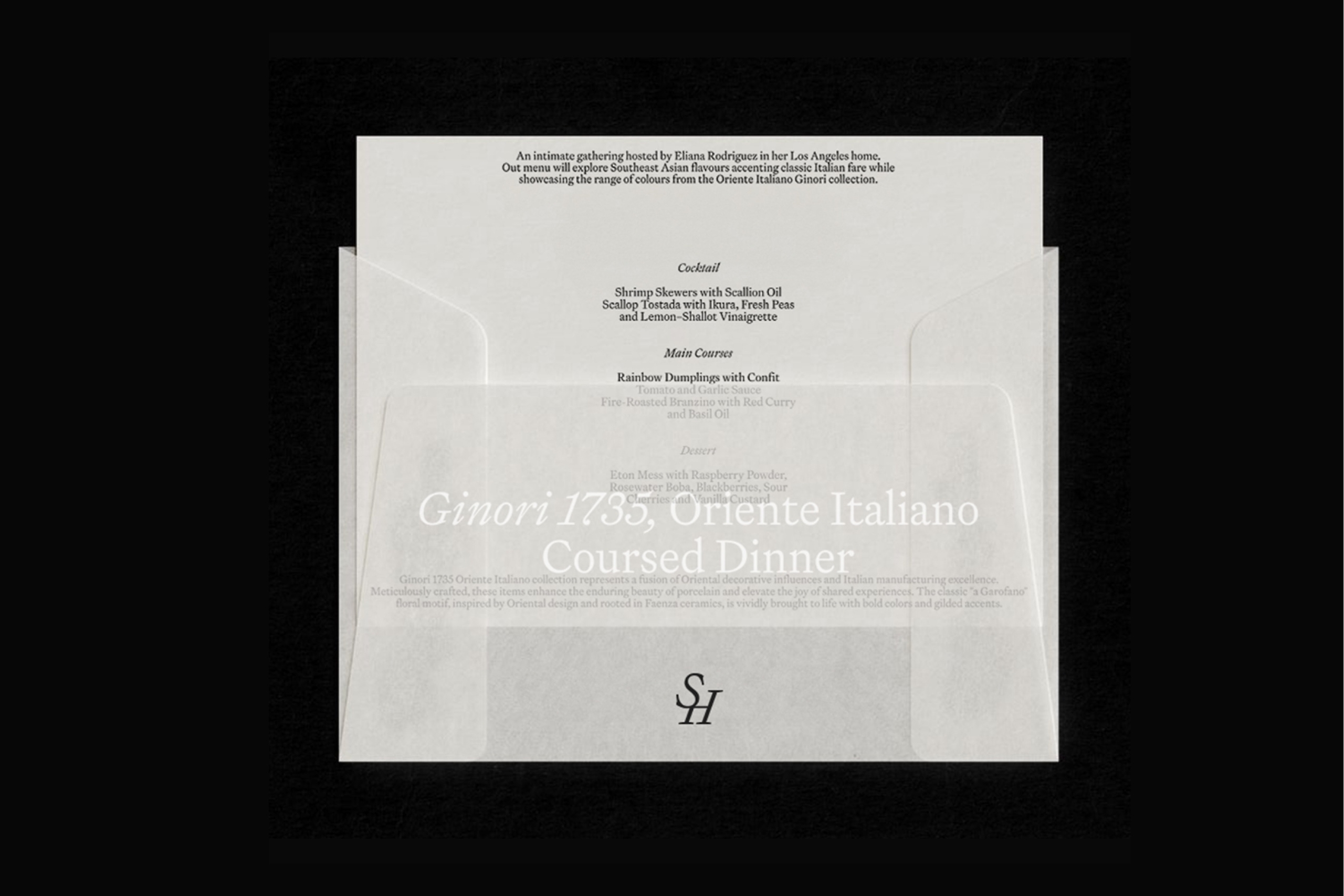
To deliver we developed a completely new visual system spanning logotype, icon and website, all drawing loosely from fine dining aesthetics while maintaining a sense of curiosity.
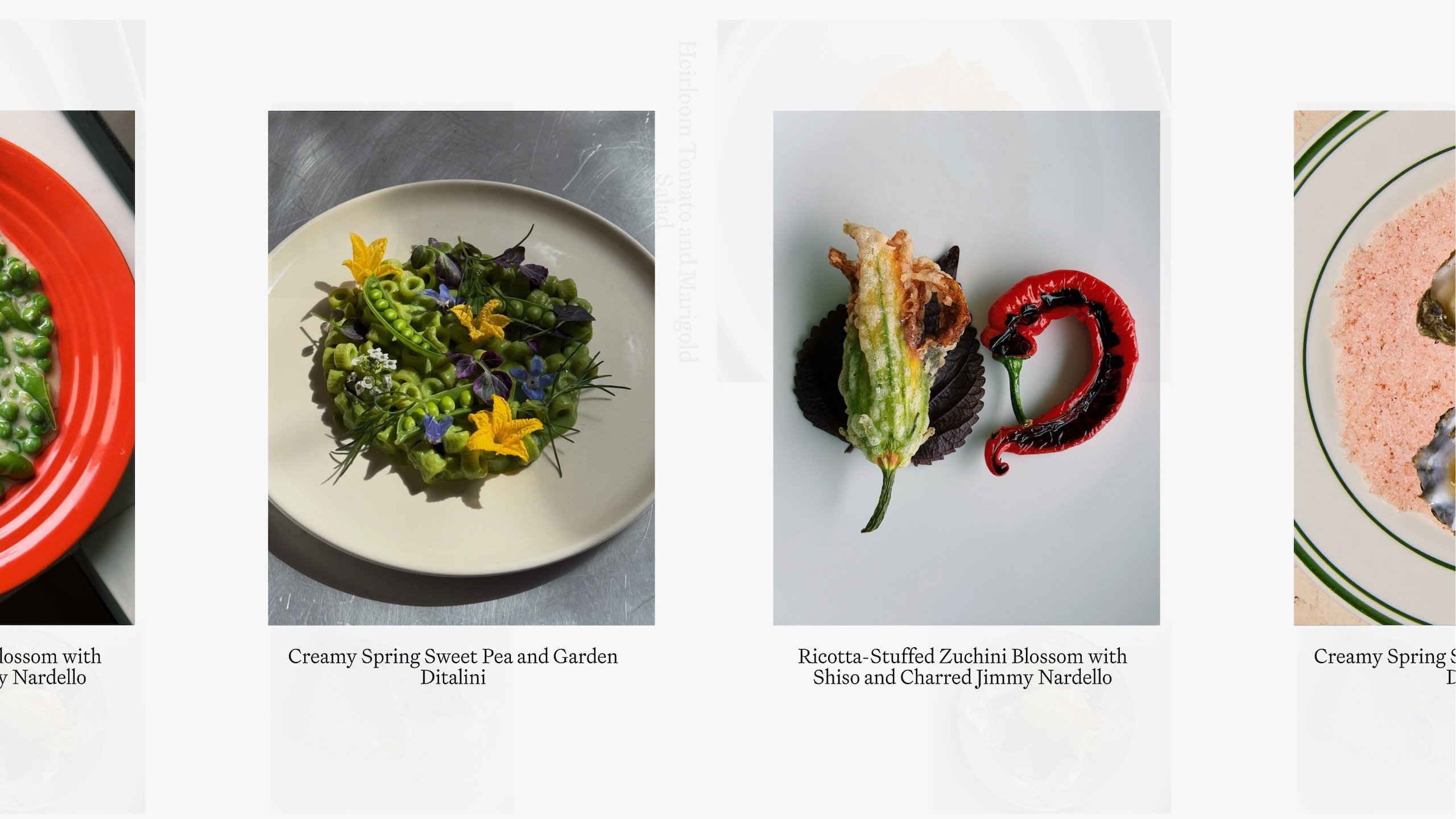
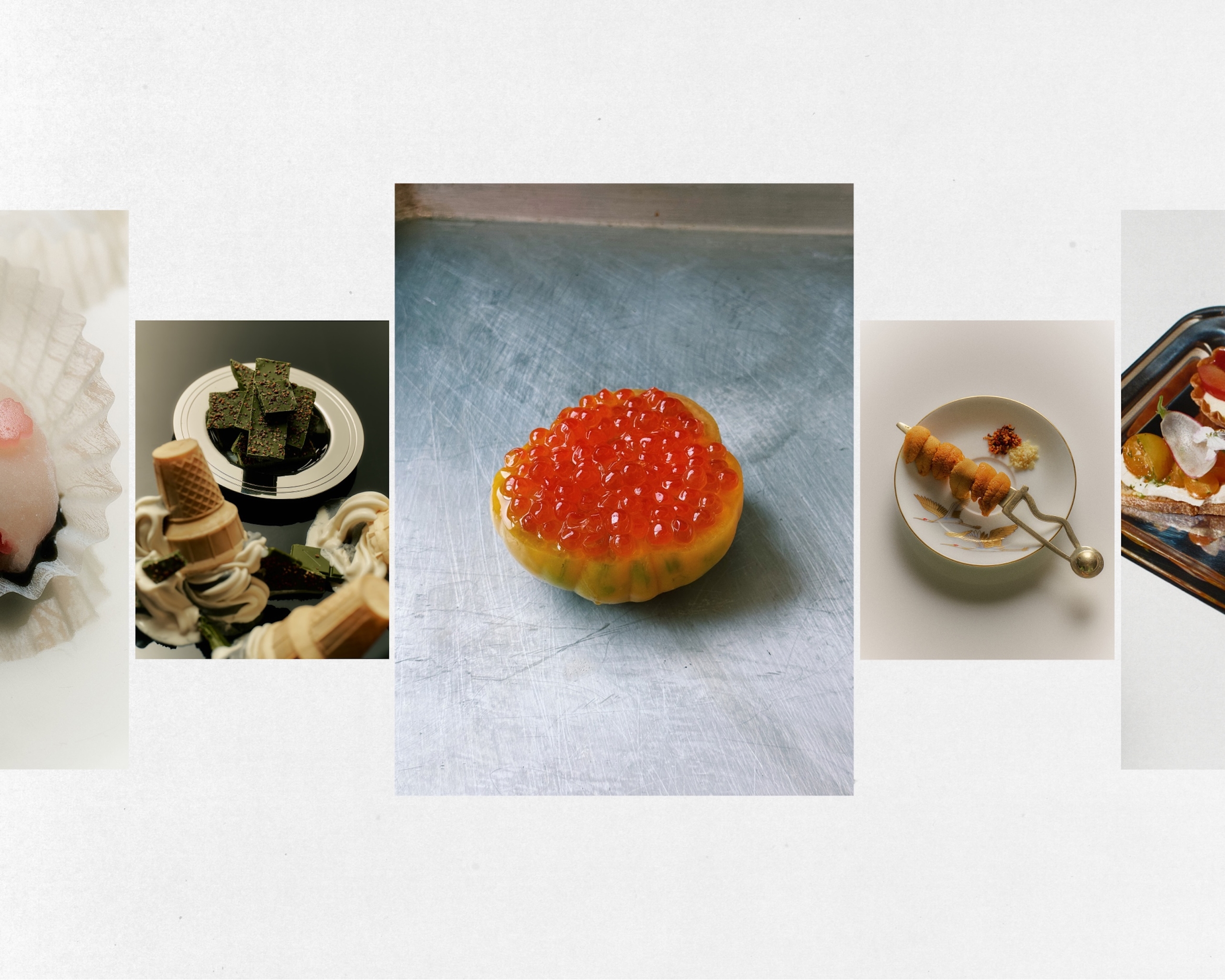
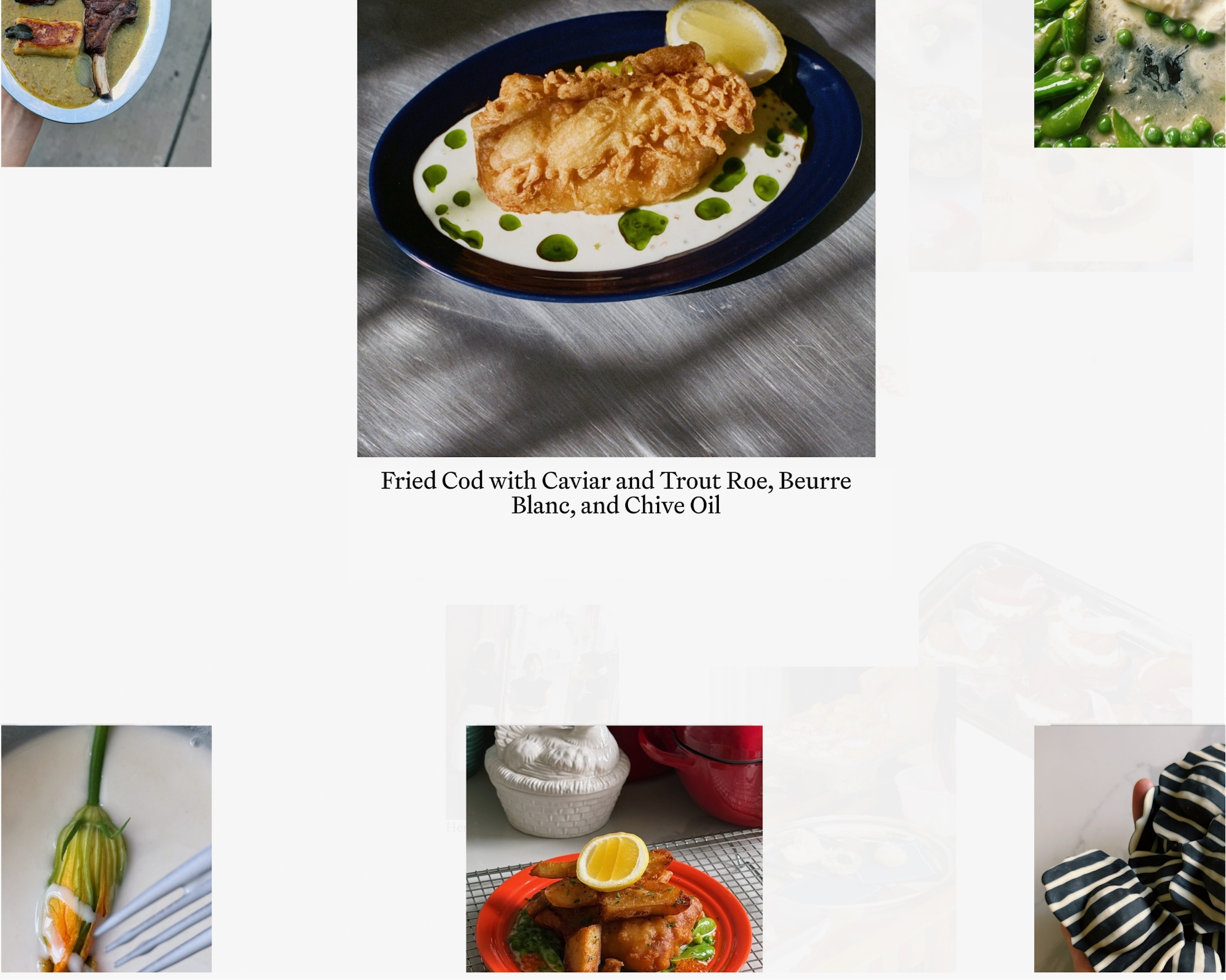
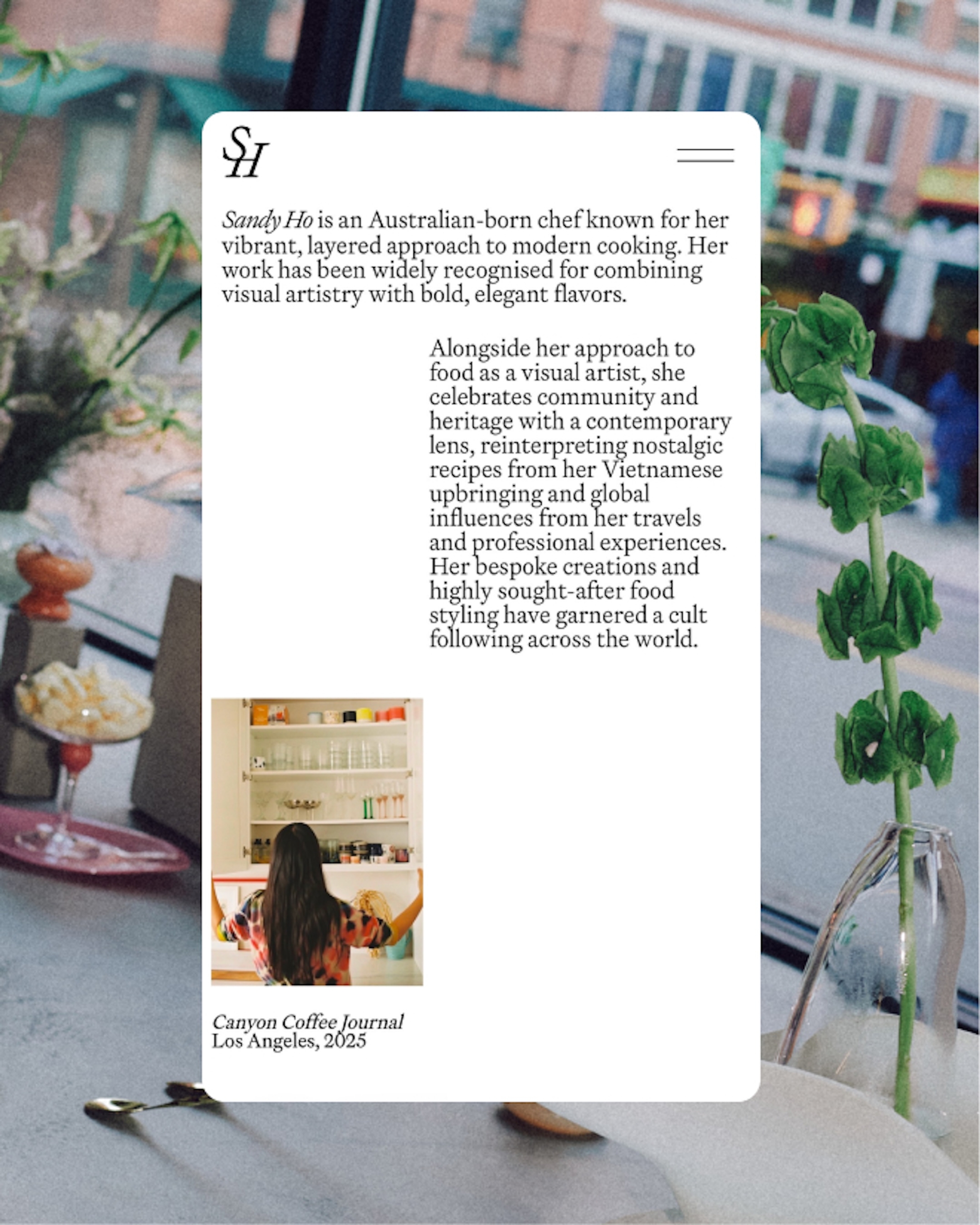
The centerpiece of the project, the website, functions as both archive and digital entry point to Sandy’s universe — documenting her dishes and unpacking her client work within an airy visual environment that cleverly balances structure with play.
A finer reflection of Sandy’s practice today, with room for what comes next.
Project Recap
Chef Sandy Ho has been our client since we designed her first book, Cooking Notes Vol, I. While continuing our work on the highly anticipated Vol, II and ahead of her move to New York City, Sandy came to us looking to evolve her broader identity.
As Sandy’s gastronomic practice has grown in recent years, the level of detail and precision has increasingly reached new heights. We knew the new identity needed to meet that shift, and on our first strategy calls joked that this engagement would mark her “major label debut.”
To deliver we developed a completely new visual system spanning logotype, icon and website, all drawing loosely from fine dining aesthetics while maintaining a sense of curiosity.
The centerpiece of the project, the website, functions as both archive and digital entry point to Sandy’s universe — documenting her dishes and unpacking her client work within an airy visual environment that cleverly balances structure with play.
Services
Strategy & Positioning
Brand Identity
Web Design
Web Development
Custom Typeface
Epicene Text by Klim Type Foundry
BonTemps Team
Albert Mestres
John Vallance
Mauro Bonillo
Priscila Casanova
Federico Salort
Collaborators
Photographers:
Juan Hernandez
Font Designers:
Héctor Ramírez