A brand built on professionalism and creative freedom,
setting a new standard in global production.
Olympic Crew is a Mexico City-based global production company whose approach merges professional rigor with artistic freedom. They approached us to craft a brand identity, website, and motion system that would distinguish them among the industry’s leading production companies, clearly communicate their decades of experience, and highlight the prestige and fresh perspective required to elevate them onto the global stage.

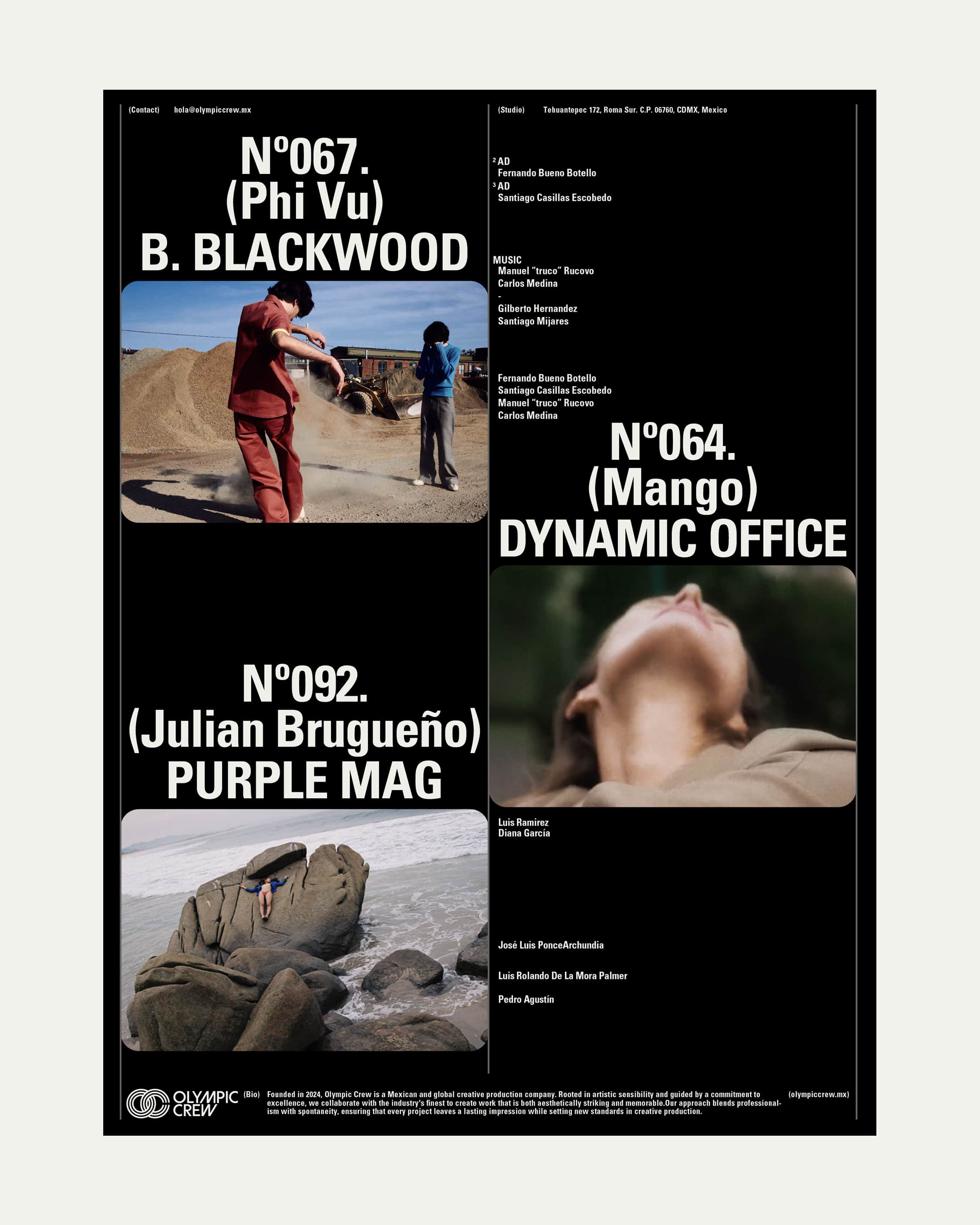
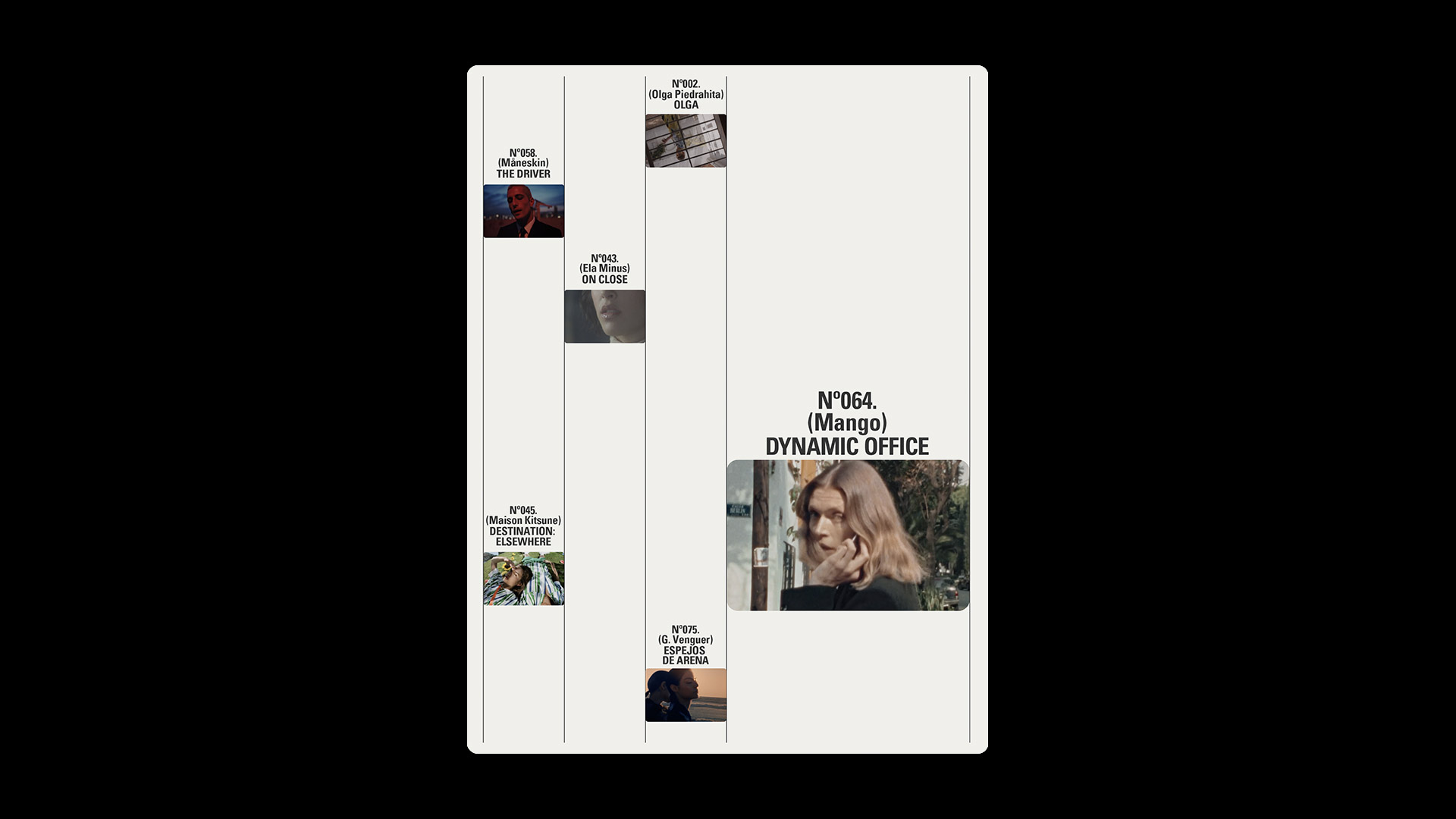
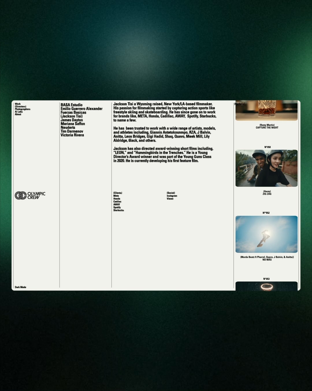
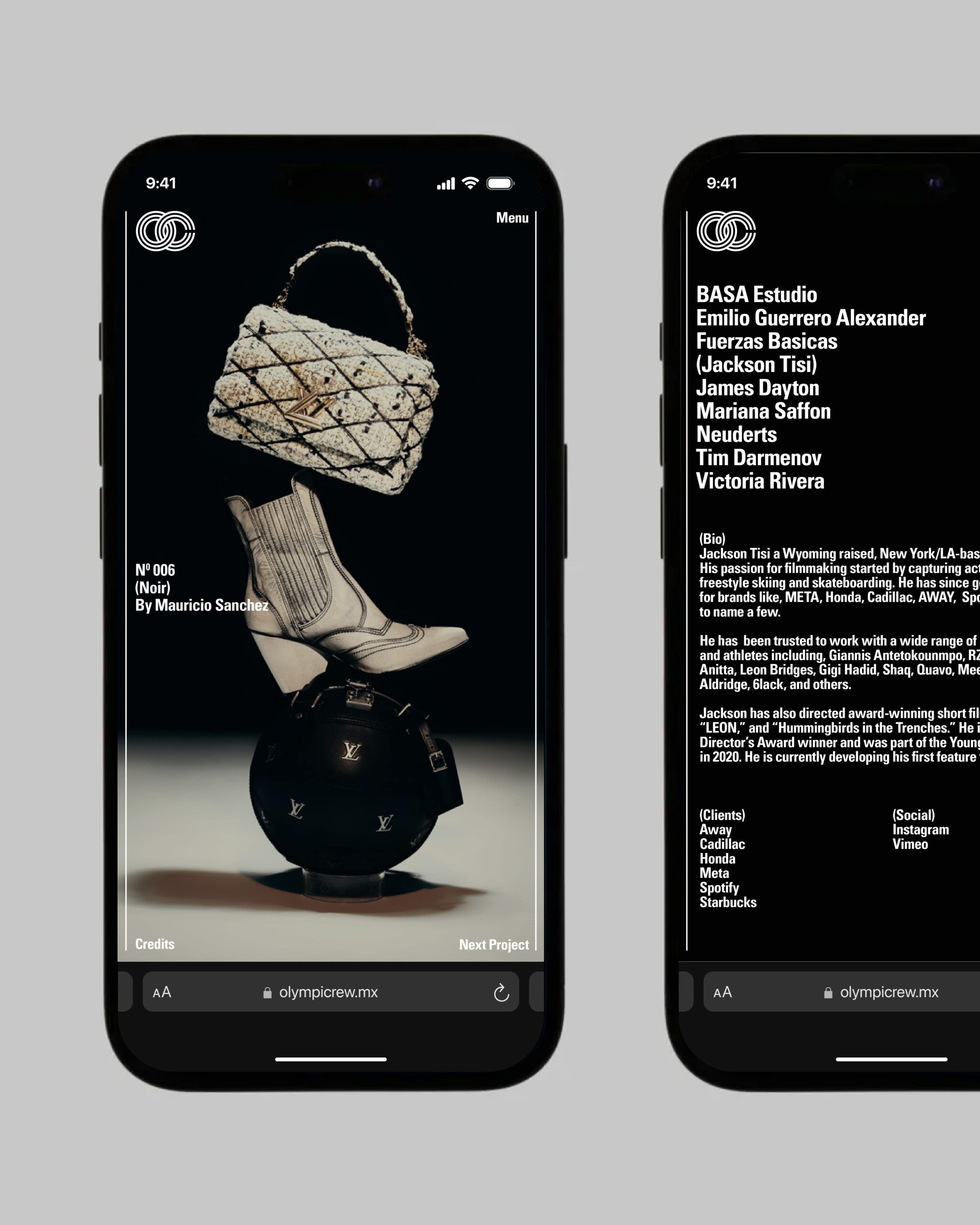
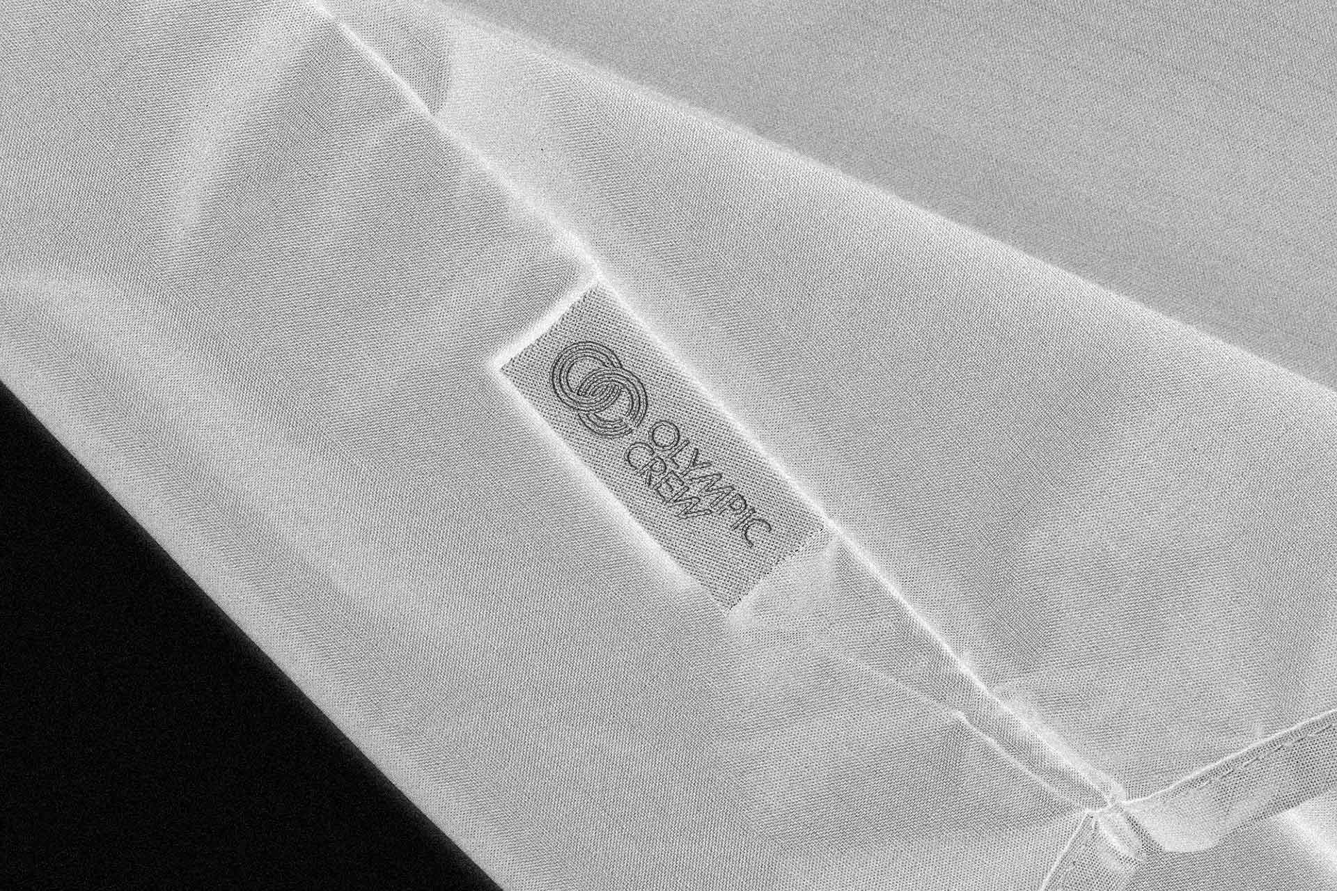


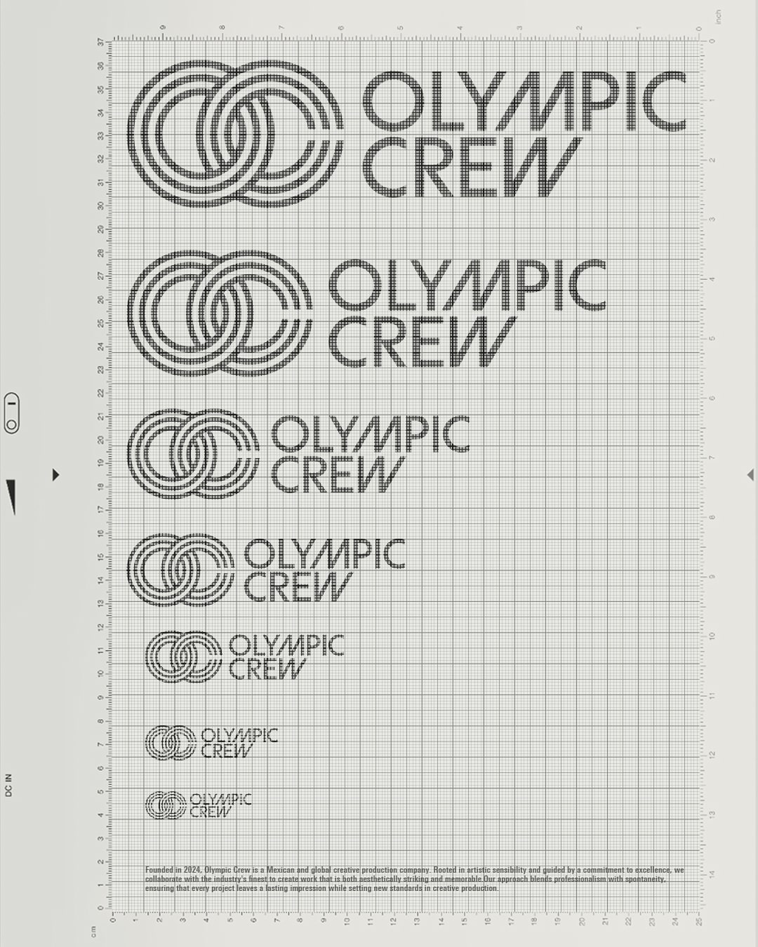
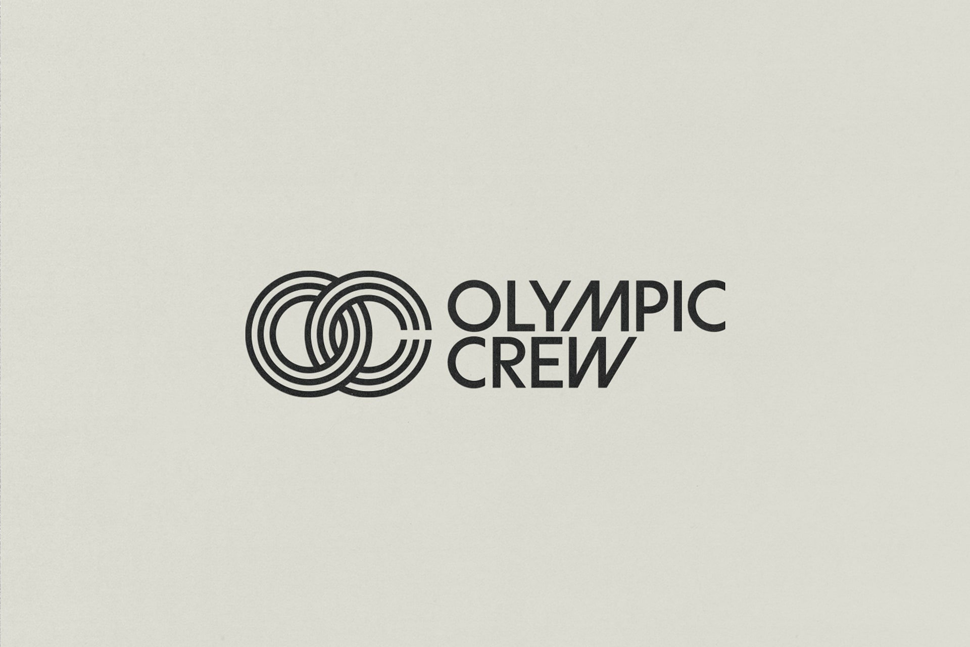
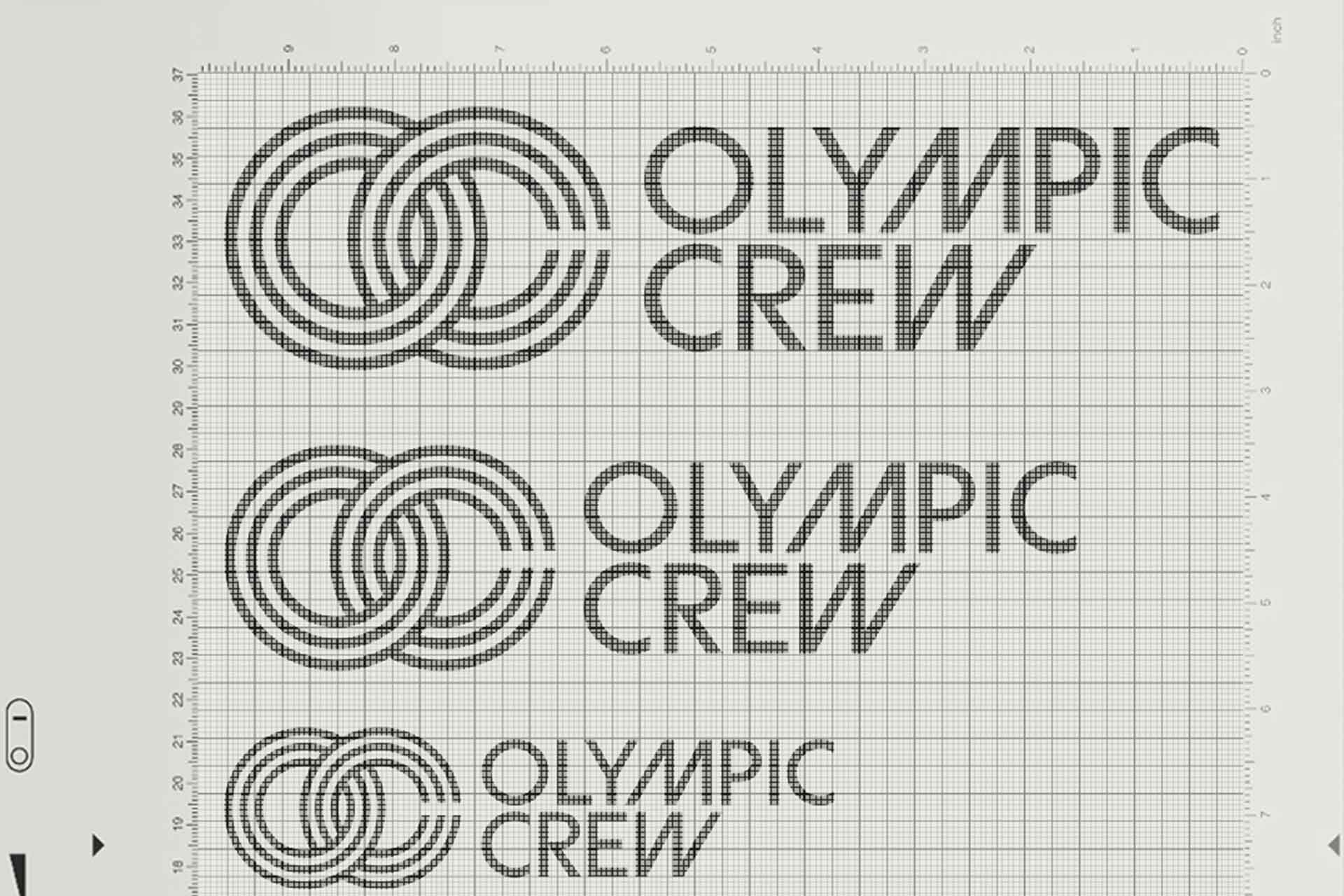
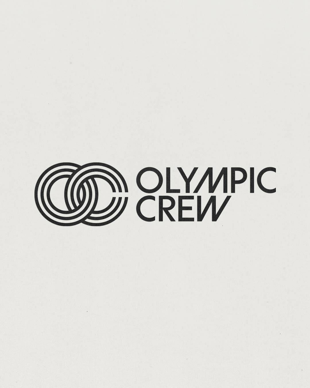
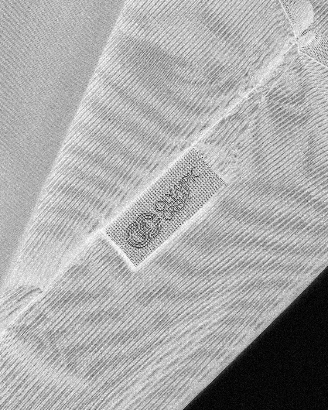
At the heart of the identity is a custom logotype and emblematic icon, designed to embody Olympic Crew’s mission of reaching new heights in creativity and production. Inspired by nostalgic geometric forms, the logotype conveys modernity and timelessness while touching upon the sublime. The interlocking “OC” icon, crafted in a fluid, racetrack-inspired style, symbolizes unity, progression, and dynamic collaboration, visually reflecting both the company’s name and character.
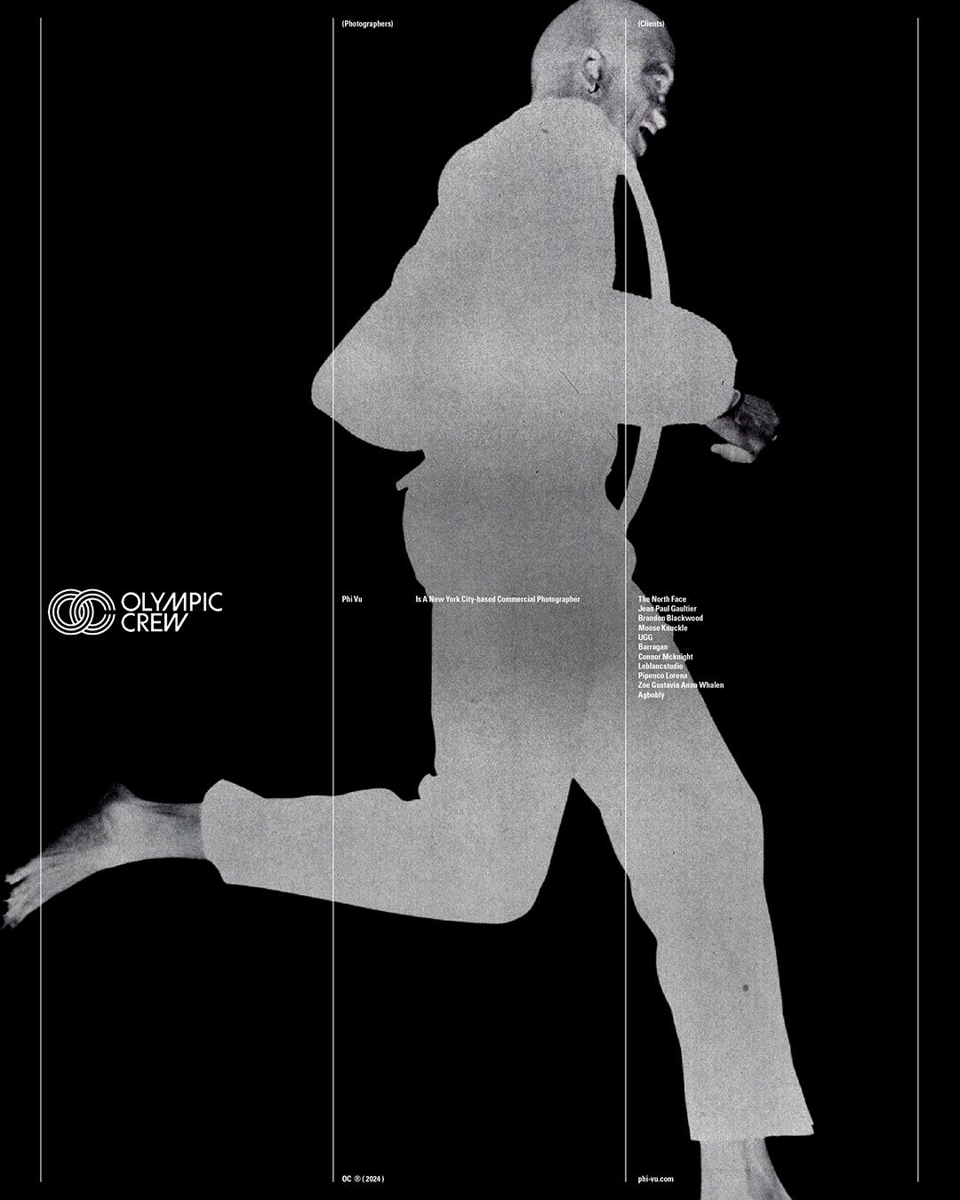
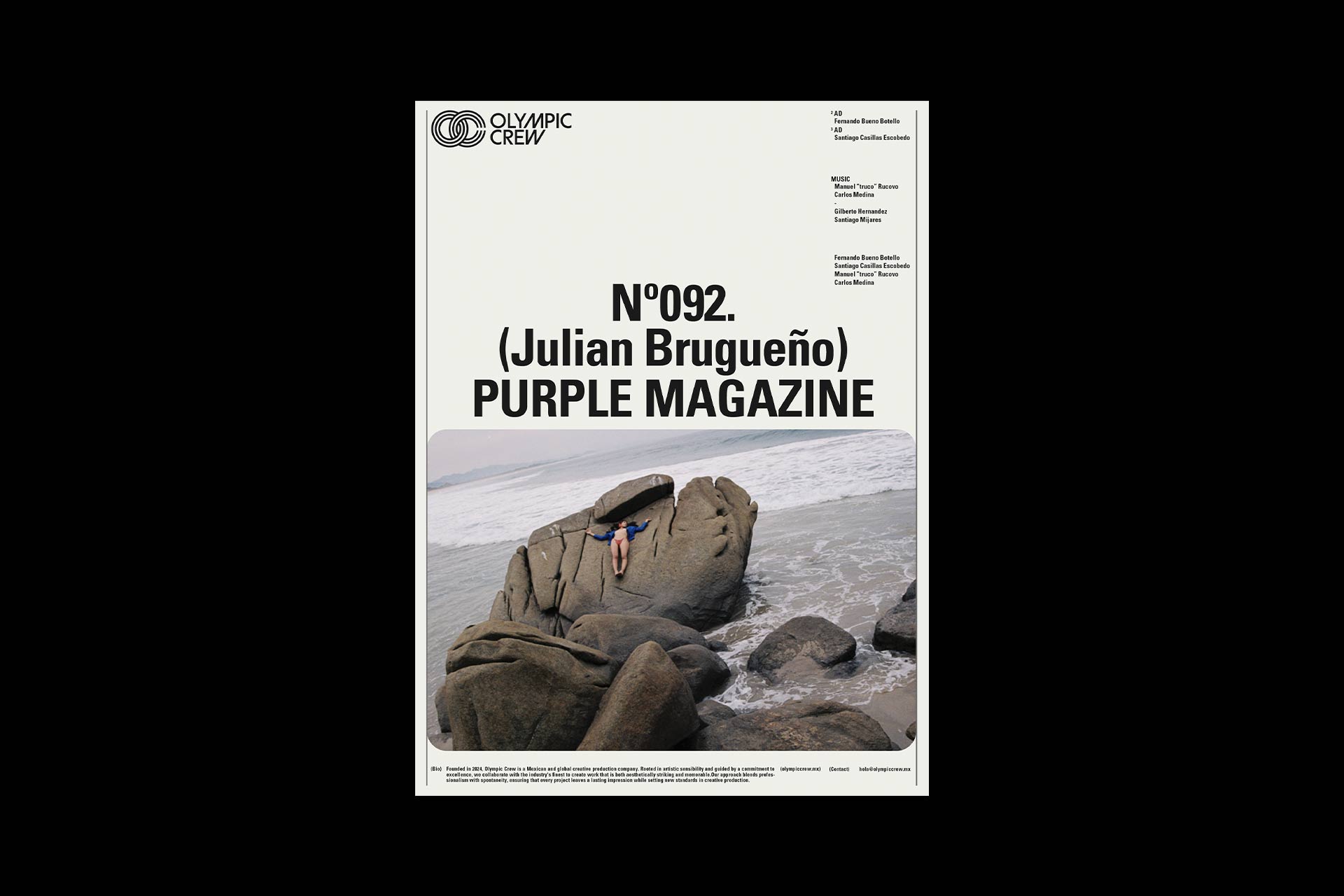
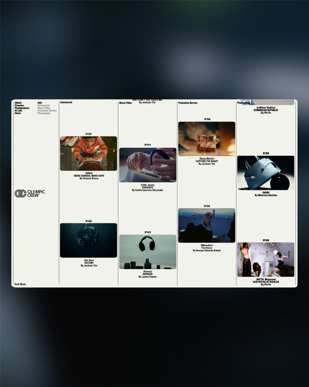
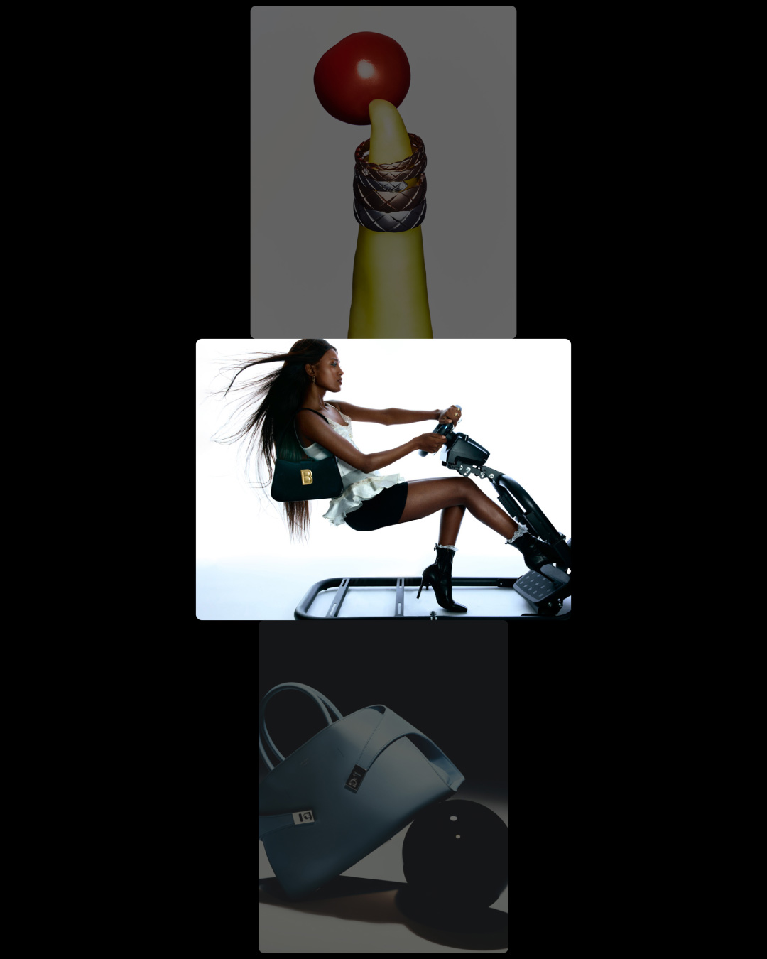
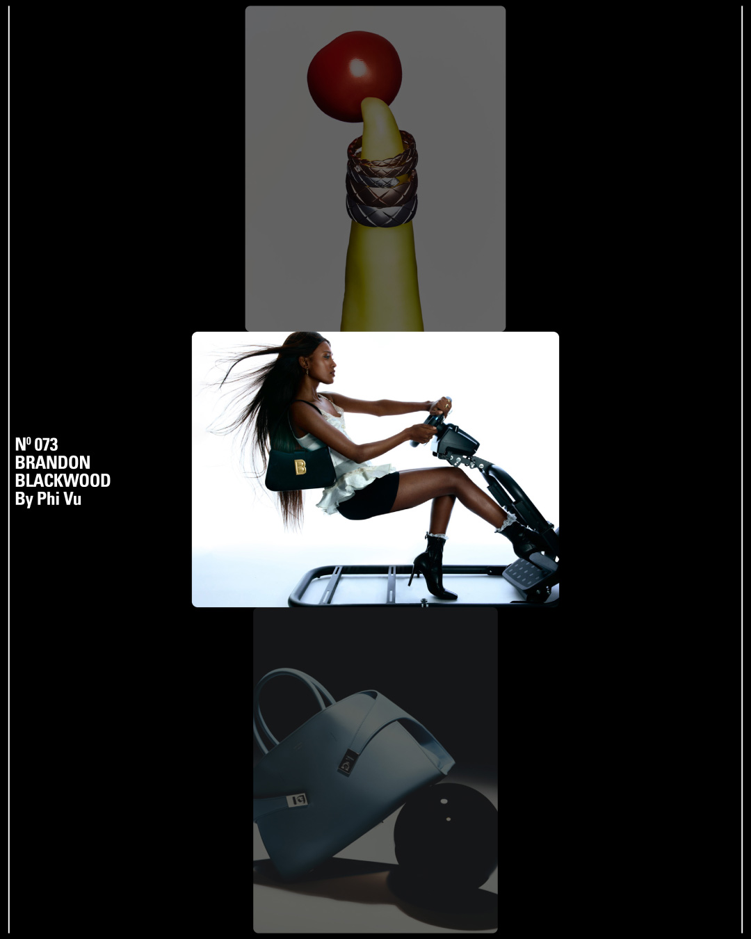
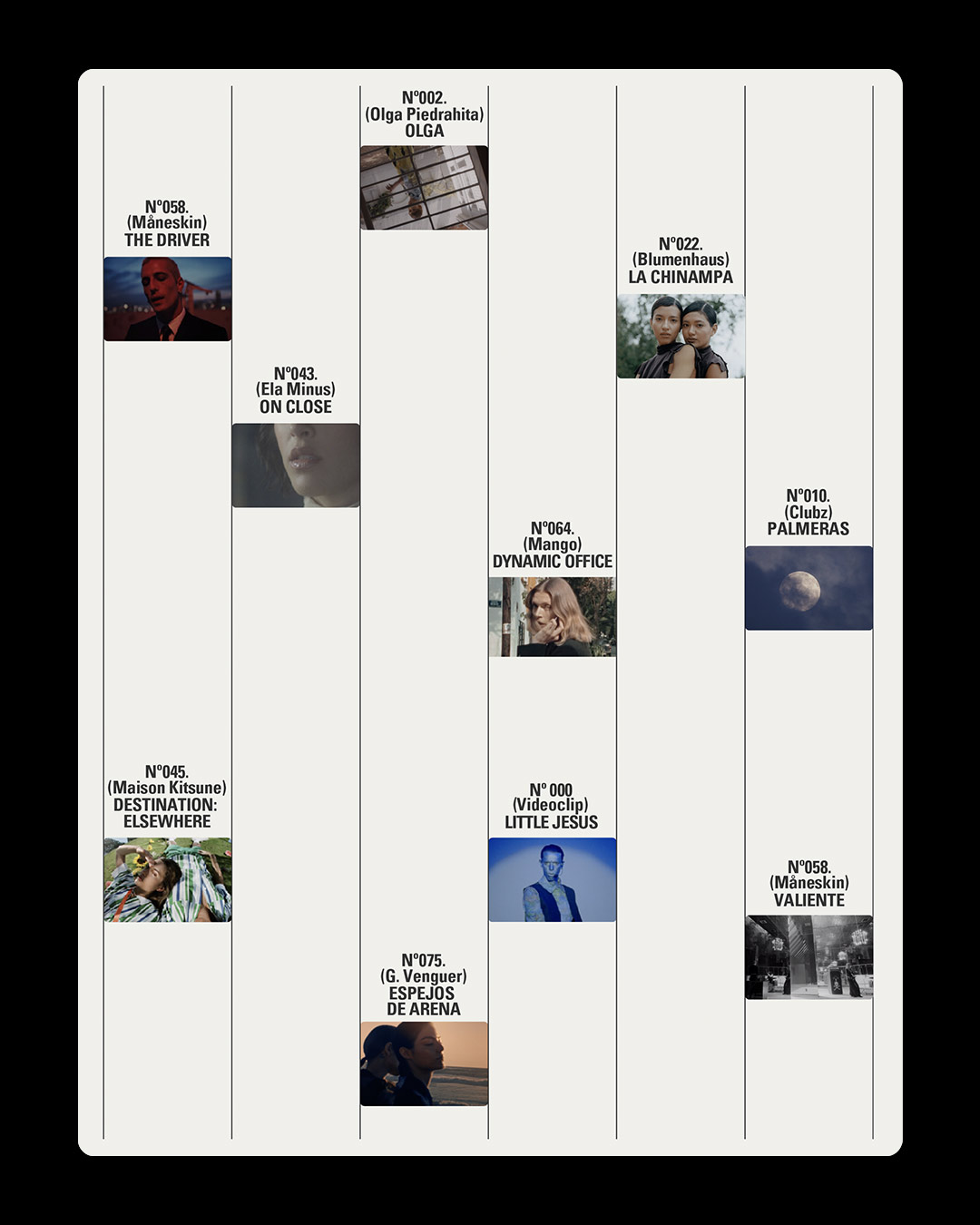
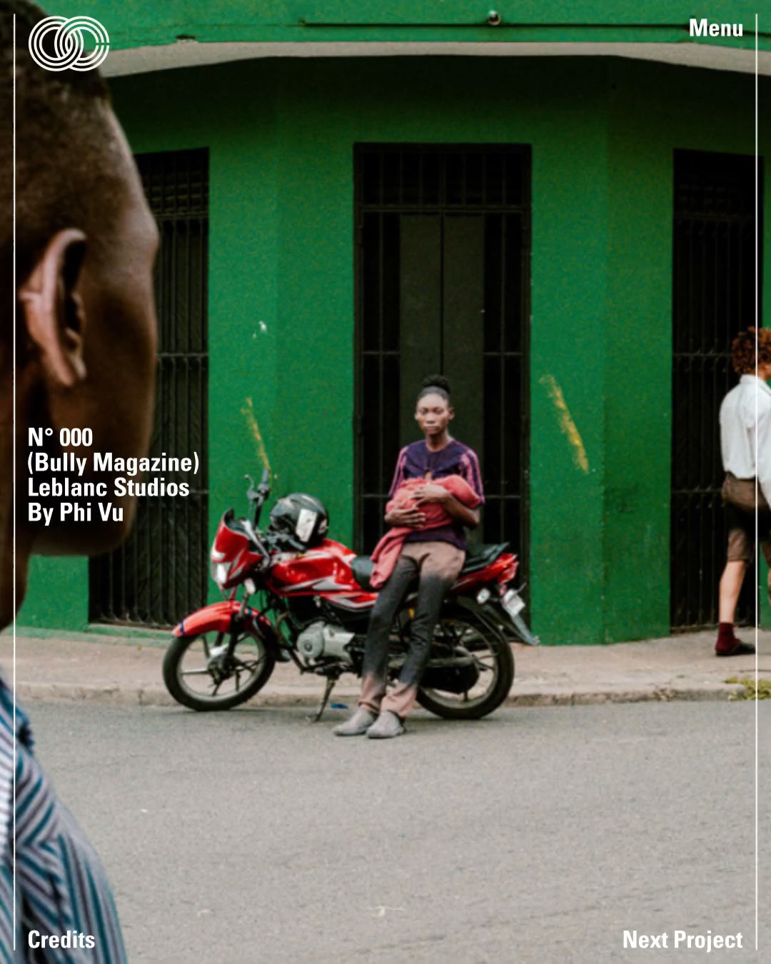
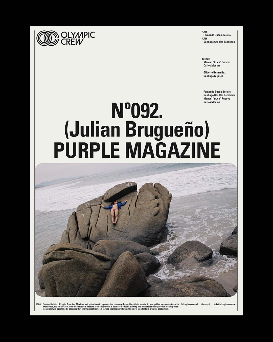
The visual system includes a modular layout designed to seamlessly adapt across various platforms and content styles. This approach not only ensures flexibility and coherence across their various touch points but also pays homage to iconic design systems of the past. The result is an identity that feels both contemporary and inherently iconic—poised to represent Olympic Crew as a dynamic leader in production.





Olympic Crew is a Mexico City-based global production company whose approach merges professional rigor with artistic freedom. They approached us to craft a brand identity, website, and motion system that would distinguish them among the industry’s leading production companies, clearly communicate their decades of experience, and highlight the prestige and fresh perspective required to elevate them onto the global stage.


At the heart of the identity is a custom logotype and emblematic icon, designed to embody Olympic Crew’s mission of reaching new heights in creativity and production. Inspired by nostalgic geometric forms, the logotype conveys modernity and timelessness while touching upon the sublime. The interlocking “OC” icon, crafted in a fluid, racetrack-inspired style, symbolizes unity, progression, and dynamic collaboration, visually reflecting both the company’s name and character.


The visual system includes a modular layout designed to seamlessly adapt across various platforms and content styles. This approach not only ensures flexibility and coherence across their various touch points but also pays homage to iconic design systems of the past. The result is an identity that feels both contemporary and inherently iconic—poised to represent Olympic Crew as a dynamic leader in production.

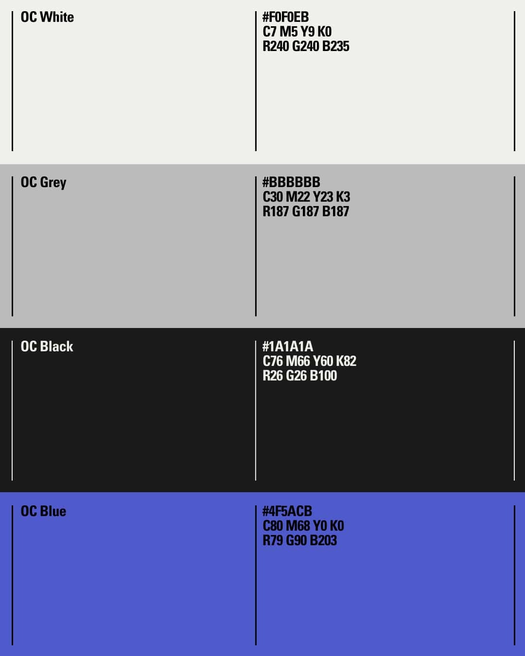
The brand utilizes blue as a sporadic accent, strategically complementing a predominantly black and white, neutral palette. This choice reflects the spirit of competition, team cohesion, and the iconic aesthetic of the Games. As a design studio, we selected blue to evoke the depth of Olympic history and the aspirational heights of athletic achievement, ensuring that even in its accentuation, the color crafts a visual language that resonates with both legacy and future potential.
