Engineering precision into a bold new identity for one of
Hong Kong’s premier eyewear manufacturers.
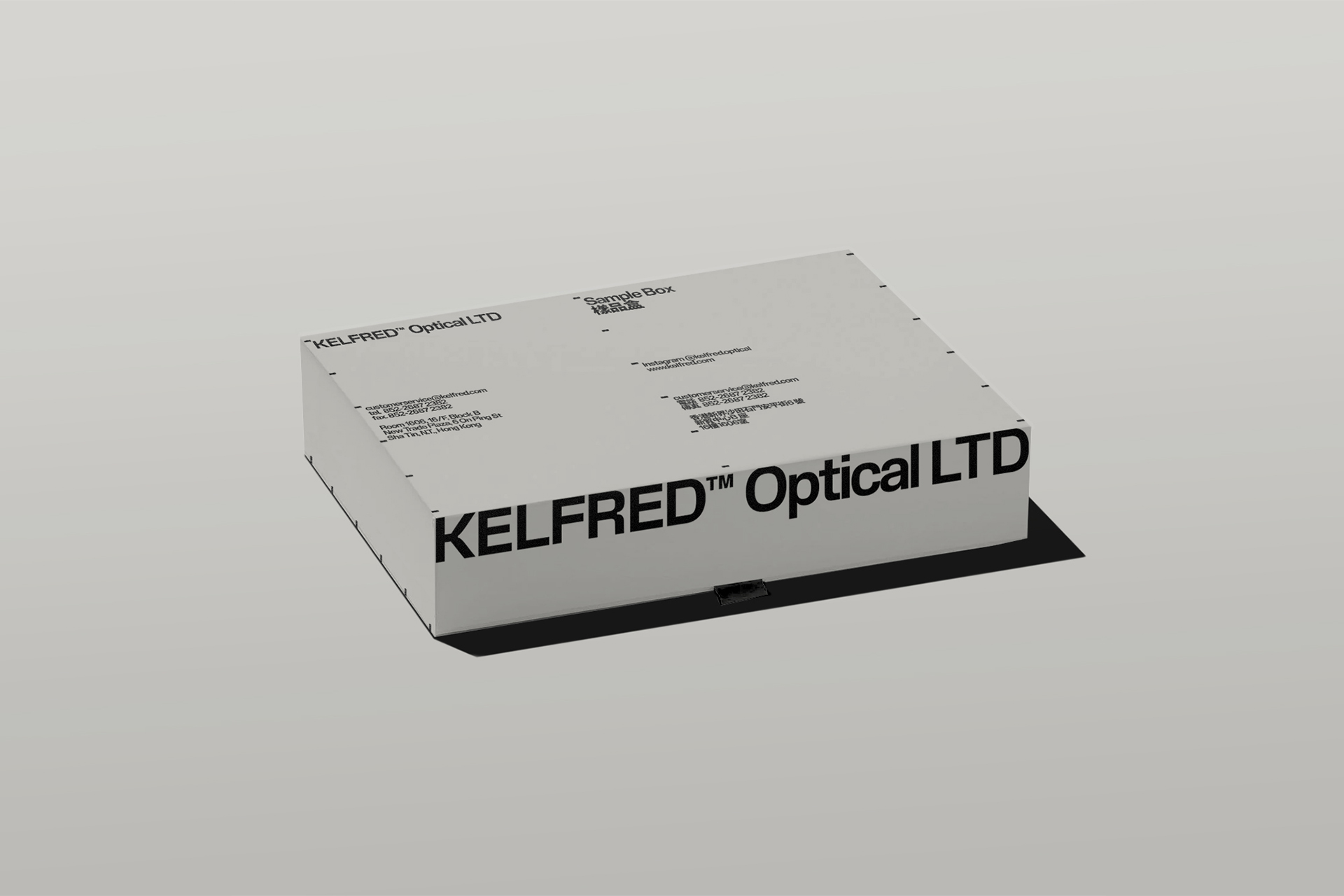
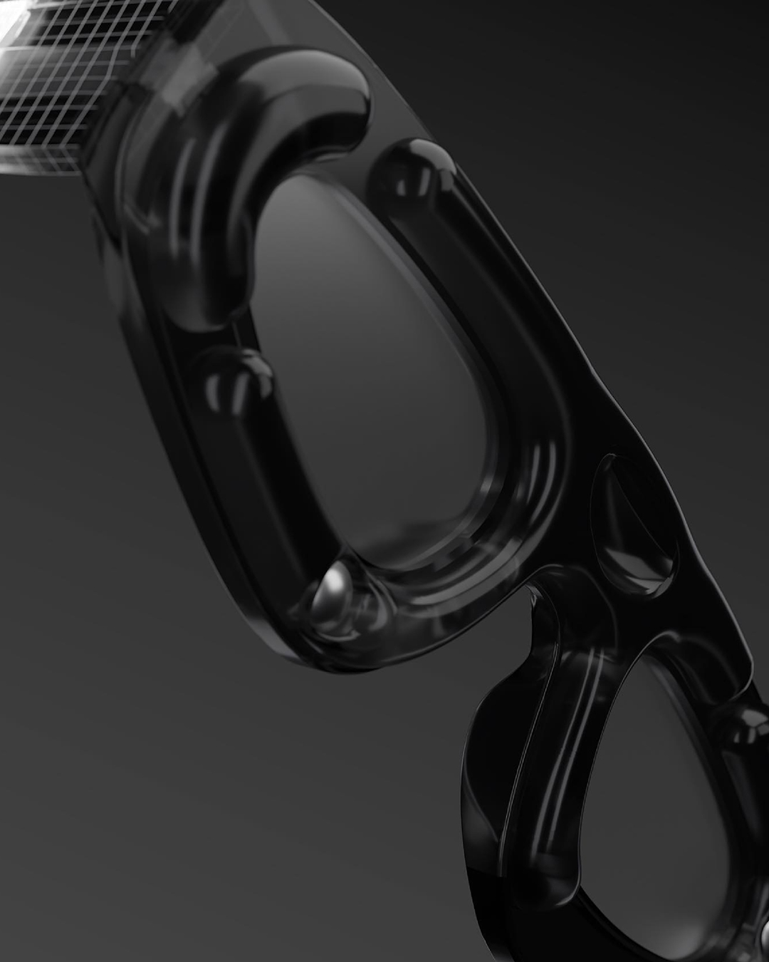
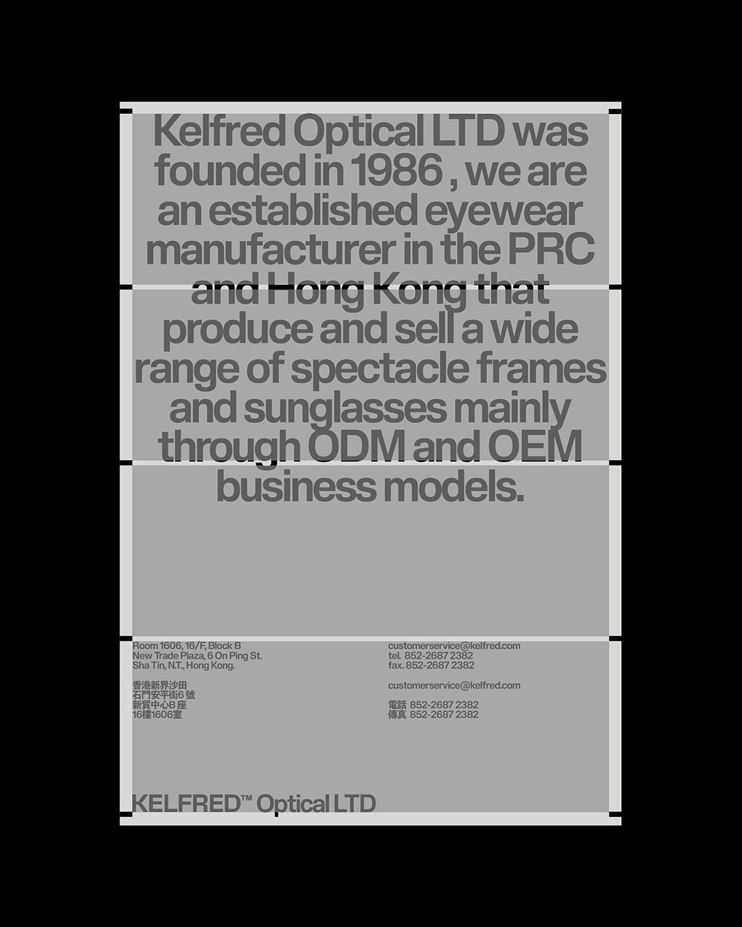
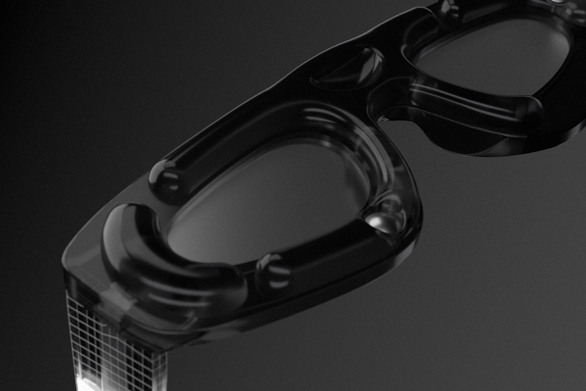
Kelfred Optical is a premier eyewear manufacturer based in Hong Kong, recognized for crafting high-quality optical frames and sunglasses. We were tasked with developing a comprehensive brand identity that mirrors Kelfred’s meticulous production methods and embodies the company’s philosophy rooted in innovation, craftsmanship, and design excellence.

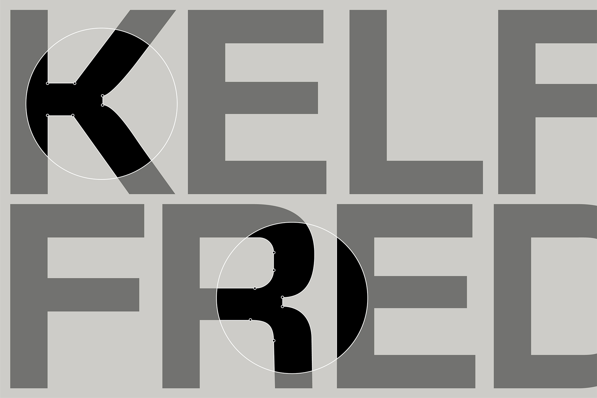
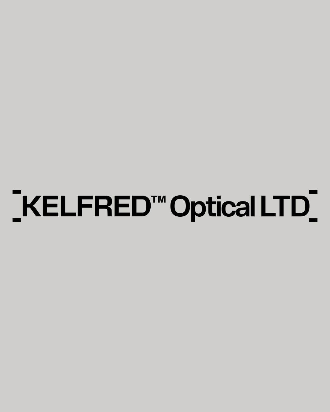
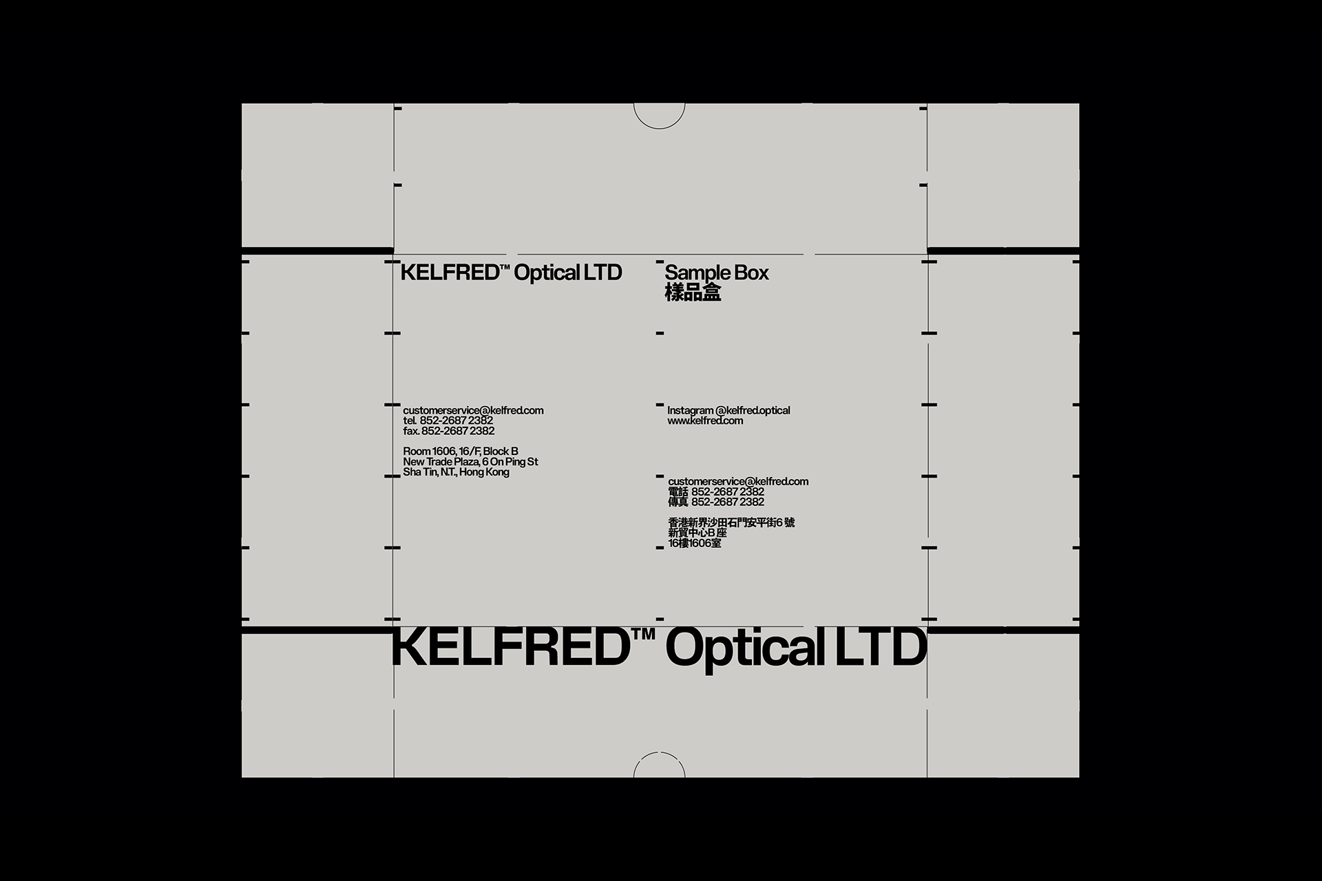
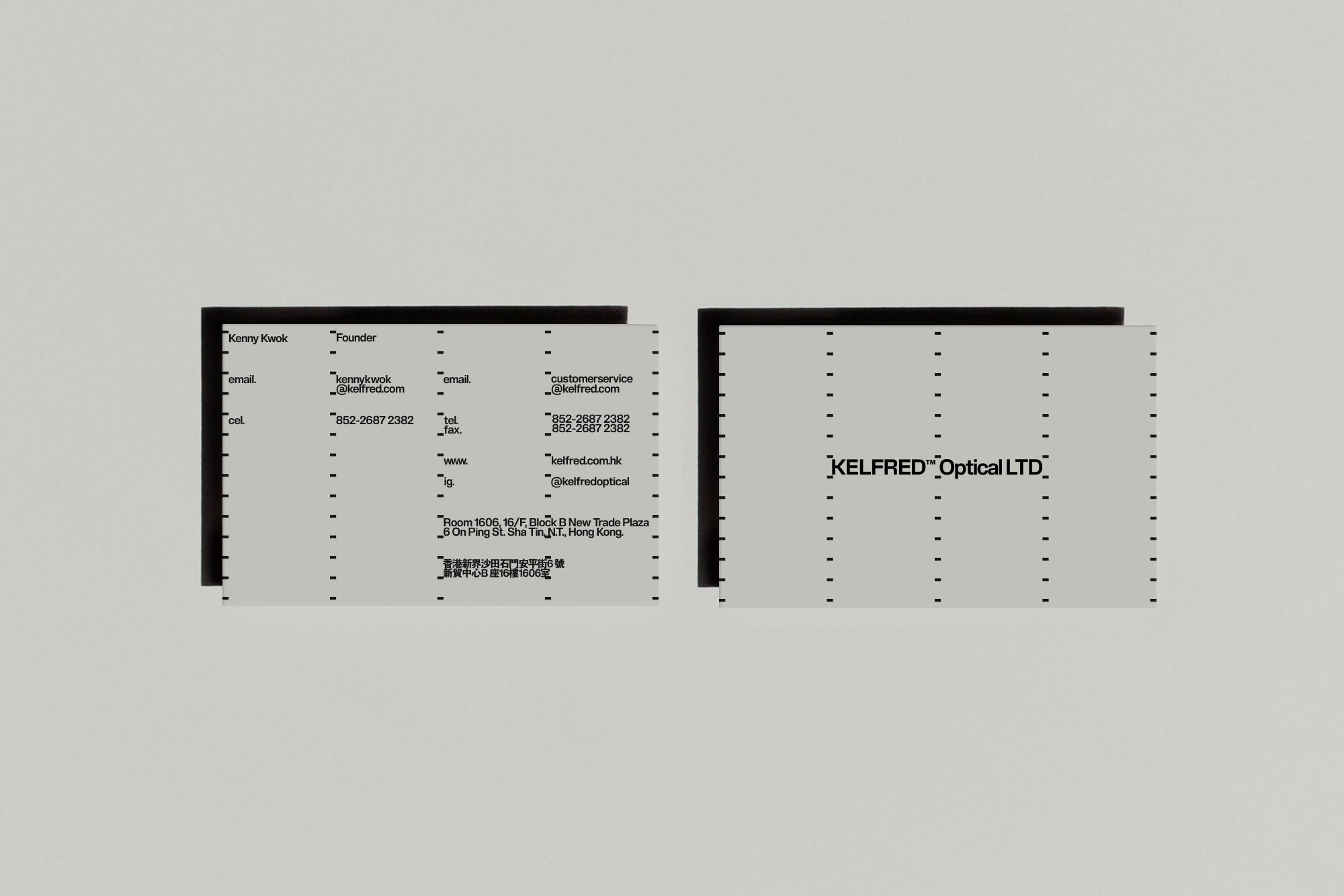
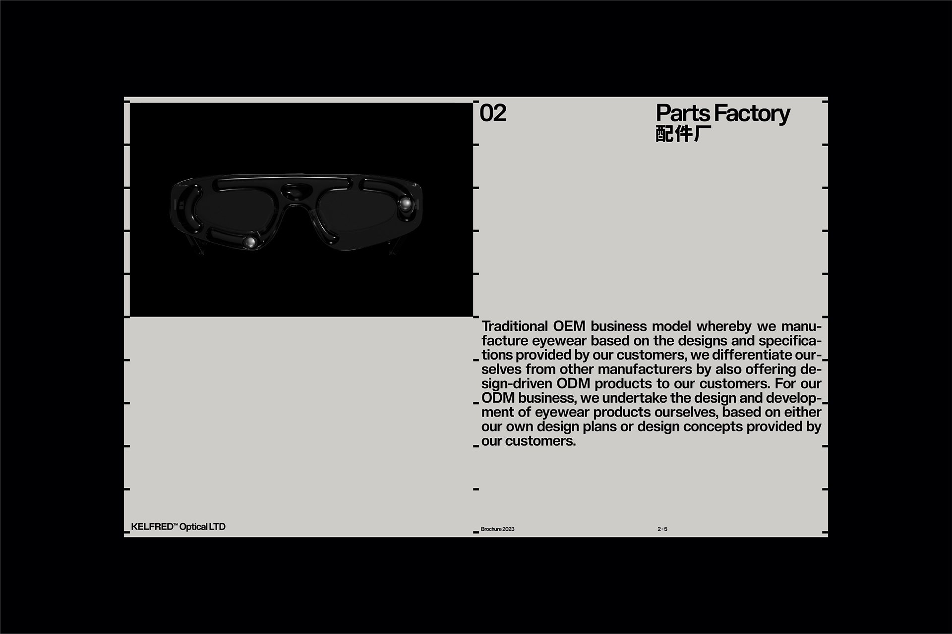
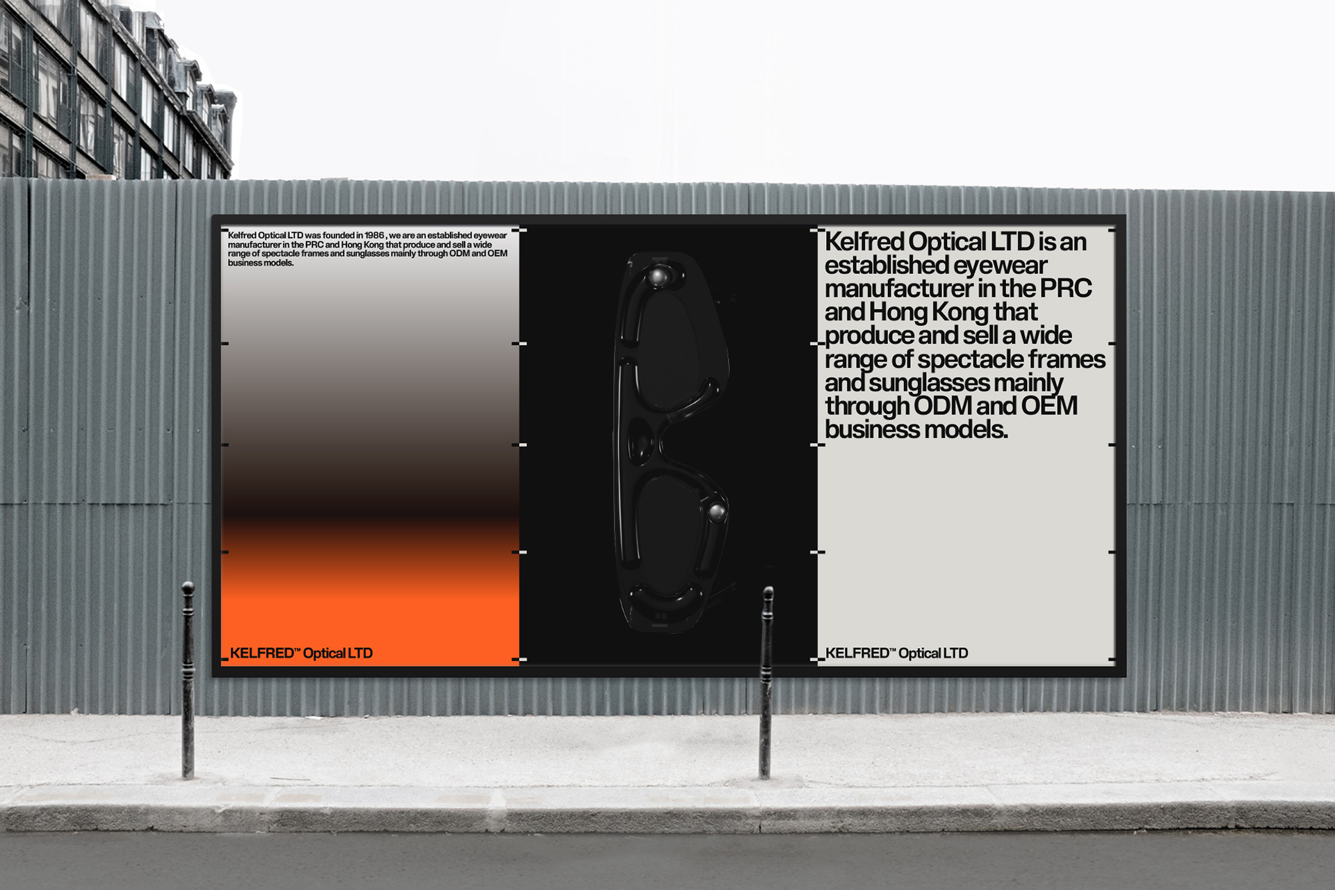
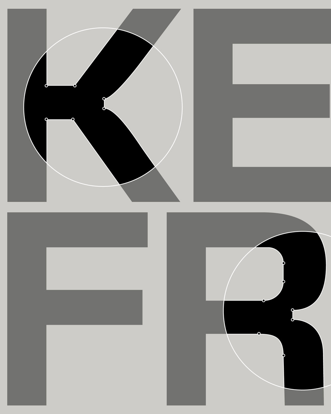
At the core of the identity is a carefully considered typographic system that reflects Kelfred’s exacting standards. Initially, the approach aimed for simplicity by using a single weight of the typeface Slussen. However, during the design process, it became clear the wordmark needed further distinction. To achieve this, subtle modifications, including the addition of ink traps, were made to several letterforms. Set in uppercase, the final wordmark is authoritative yet functional, embodying both precision and expressiveness.
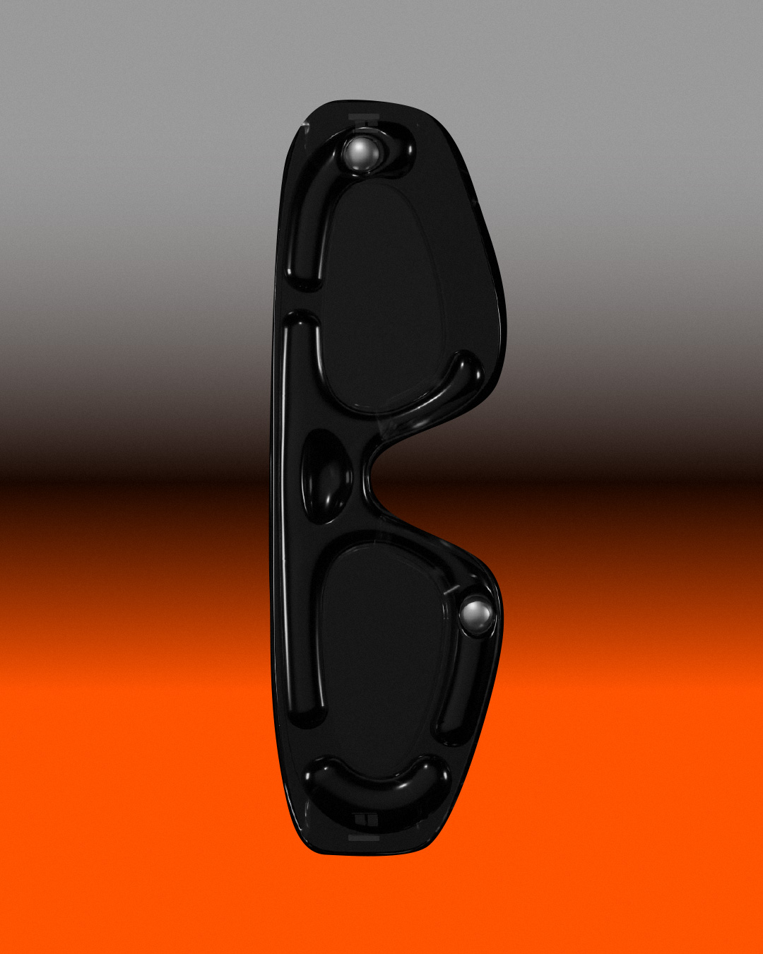
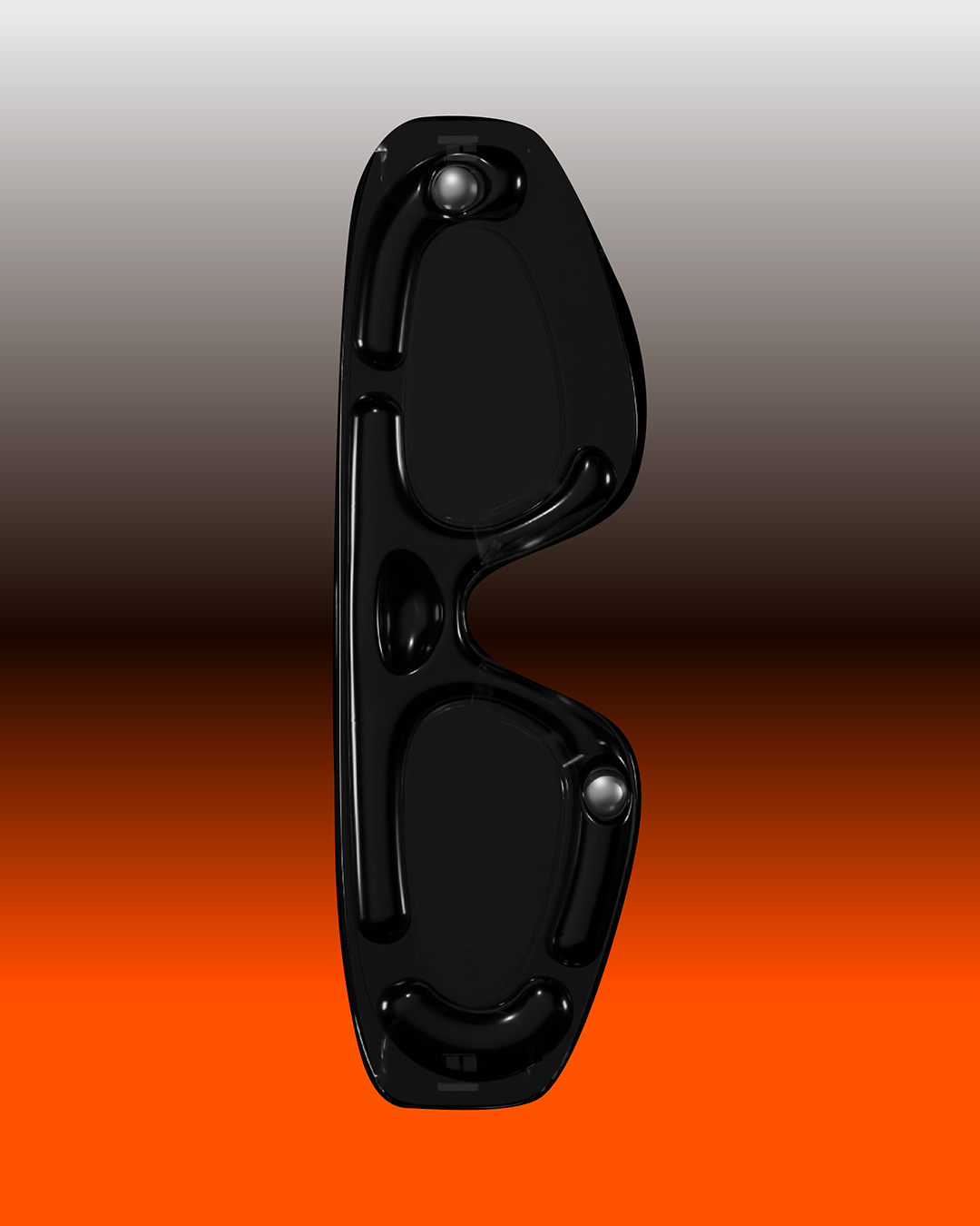
Complementing this disciplined typographic approach, the identity introduces strategic use of color and gradients, creating an engaging visual tension. The primary palette employs neutral tones—warm grey and black—to communicate timelessness and sophistication. Contrastingly, an eye-catching bright orange shade and gradient were introduced as secondary elements. These vibrant additions add a sense of intrigue and attitude, enhancing the brand’s dynamic presence.
Together, these elements form a cohesive visual language, balancing structure and boldness, sophistication and energy—establishing Kelfred Optical as both technically proficient and distinctly contemporary.
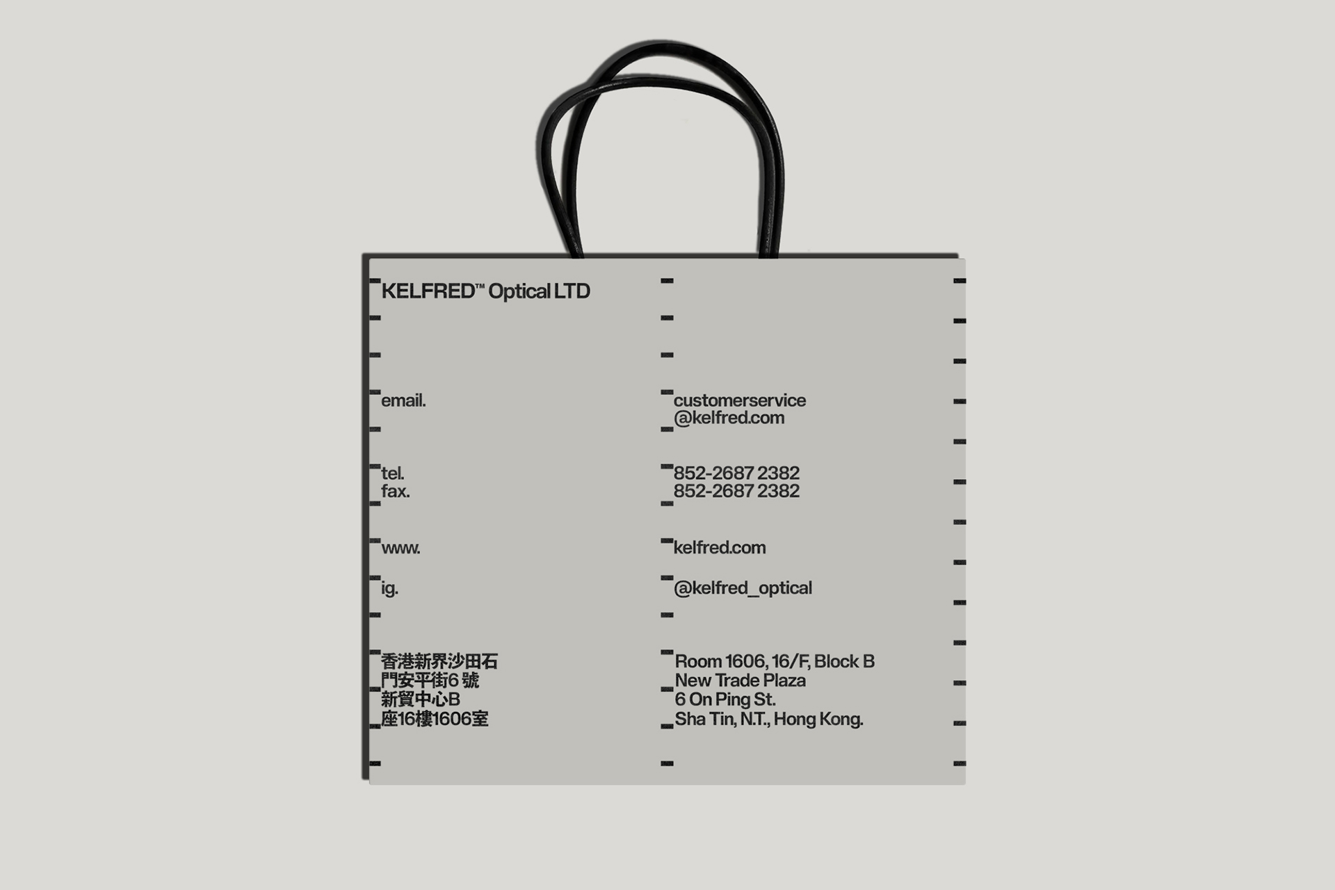
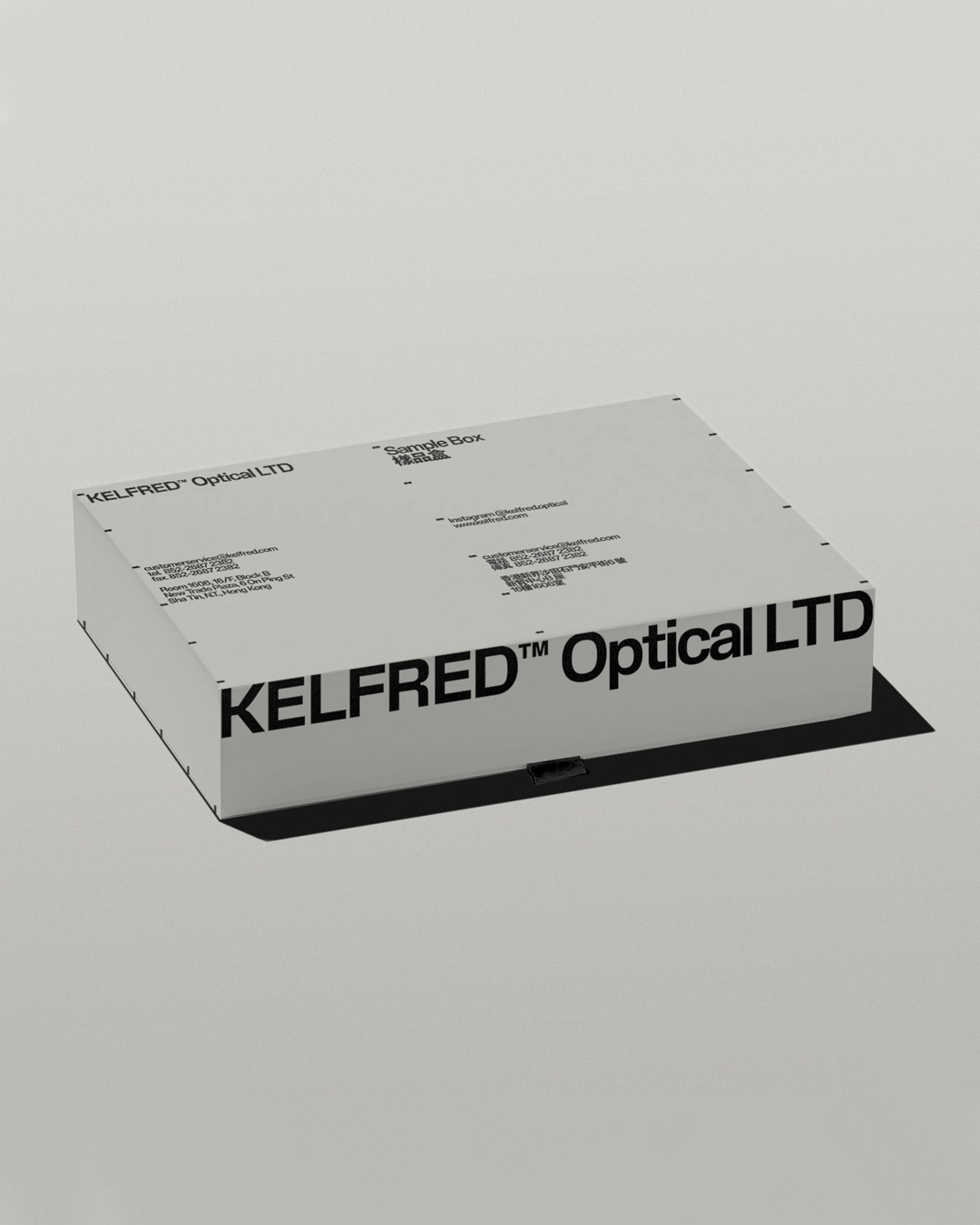

Kelfred Optical is a premier eyewear manufacturer based in Hong Kong, recognized for crafting high-quality optical frames and sunglasses. We were tasked with developing a comprehensive brand identity that mirrors Kelfred’s meticulous production methods and embodies the company’s philosophy rooted in innovation, craftsmanship, and design excellence.
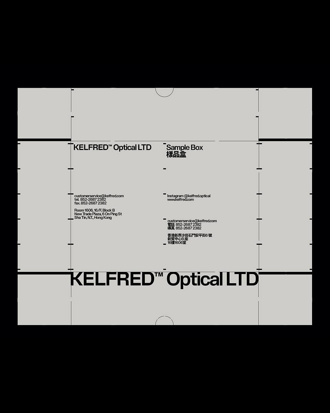
At the core of the identity is a carefully considered typographic system that reflects Kelfred’s exacting standards. Initially, the approach aimed for simplicity by using a single weight of the typeface Slussen. However, during the design process, it became clear the wordmark needed further distinction. To achieve this, subtle modifications, including the addition of ink traps, were made to several letterforms. Set in uppercase, the final wordmark is authoritative yet functional, embodying both precision and expressiveness.
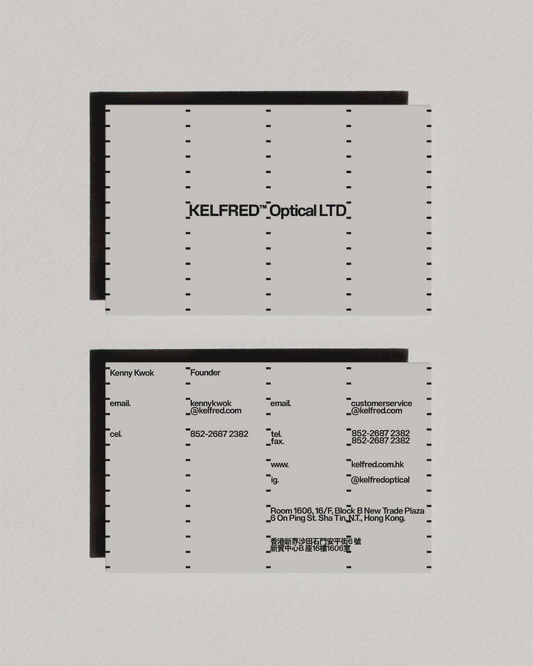
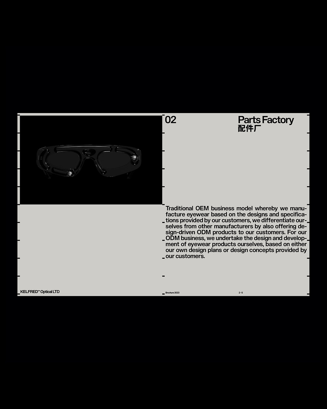

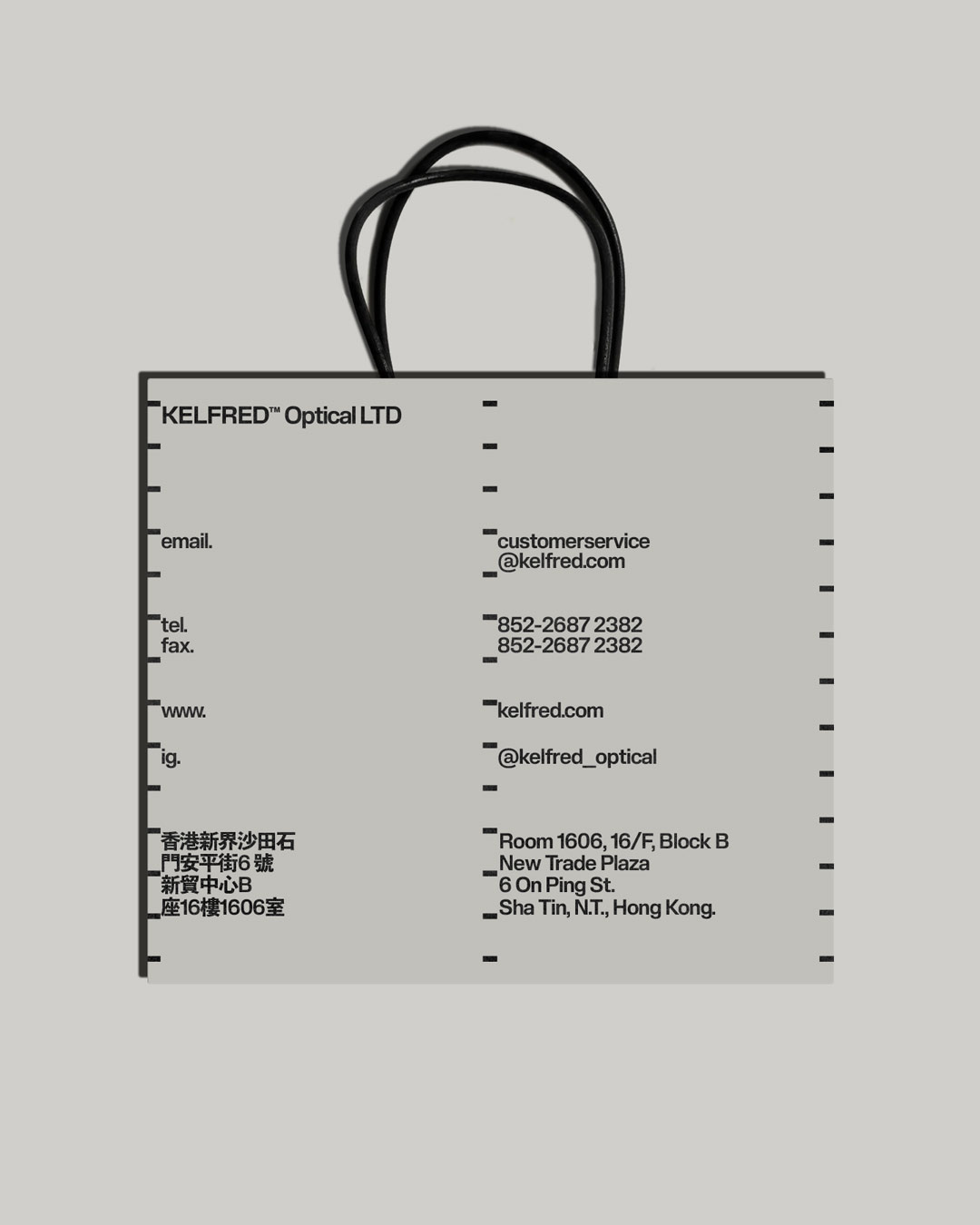

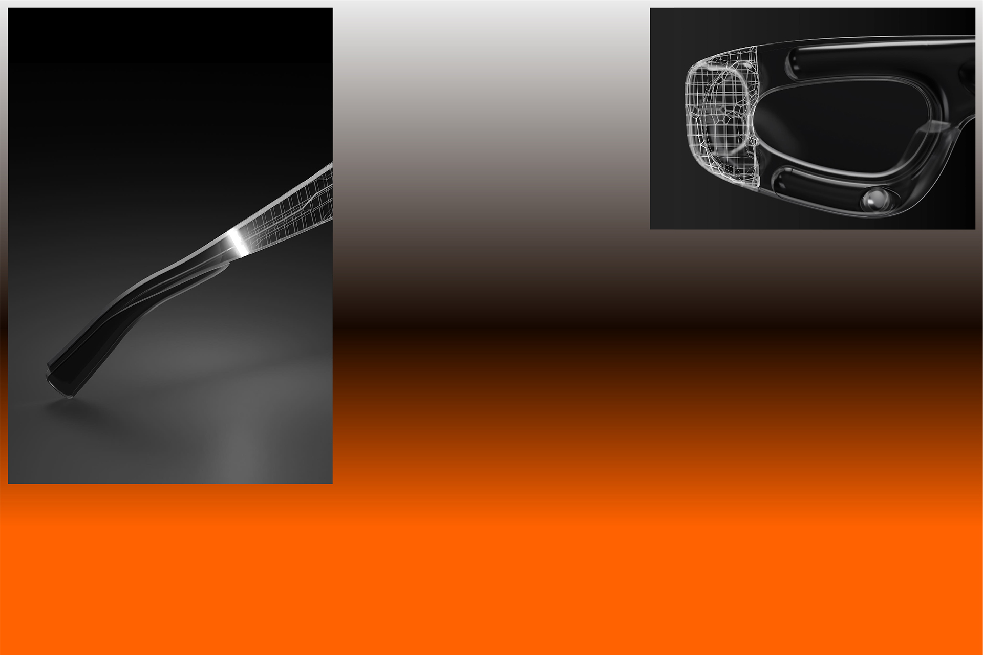
Complementing this disciplined typographic approach, the identity introduces strategic use of color and gradients, creating an engaging visual tension. The primary palette employs neutral tones—warm grey and black—to communicate timelessness and sophistication. Contrastingly, an eye-catching bright orange shade and gradient were introduced as secondary elements. These vibrant additions add a sense of intrigue and attitude, enhancing the brand’s dynamic presence.
Together, these elements form a cohesive visual language, balancing structure and boldness, sophistication and energy—establishing Kelfred Optical as both technically proficient and distinctly contemporary.