Sensory luxury defined by intimacy and discovery, straight from the California coast.
Santa Barbara’s boutique shopping scene was overdue for a shake-up. Snack founder & CEO, Noa Wilde, came to us with an ambitious vision that at the time felt just beyond her grasp.
What was missing wasn’t taste or instinct, but clarity. Our work focused on surfacing the deeper ideas by naming the contradictions, defining her values, and turning intuition into a system she could lead with confidence.
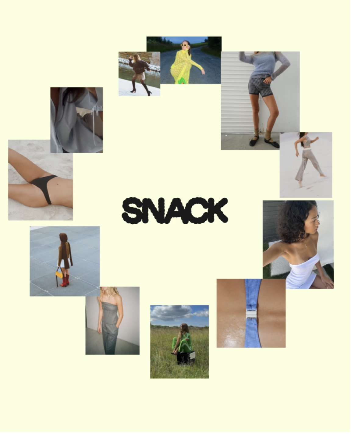
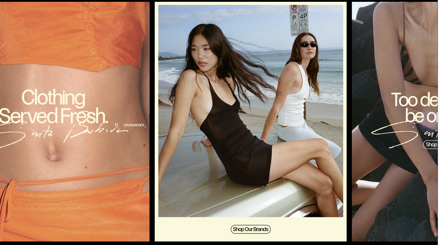
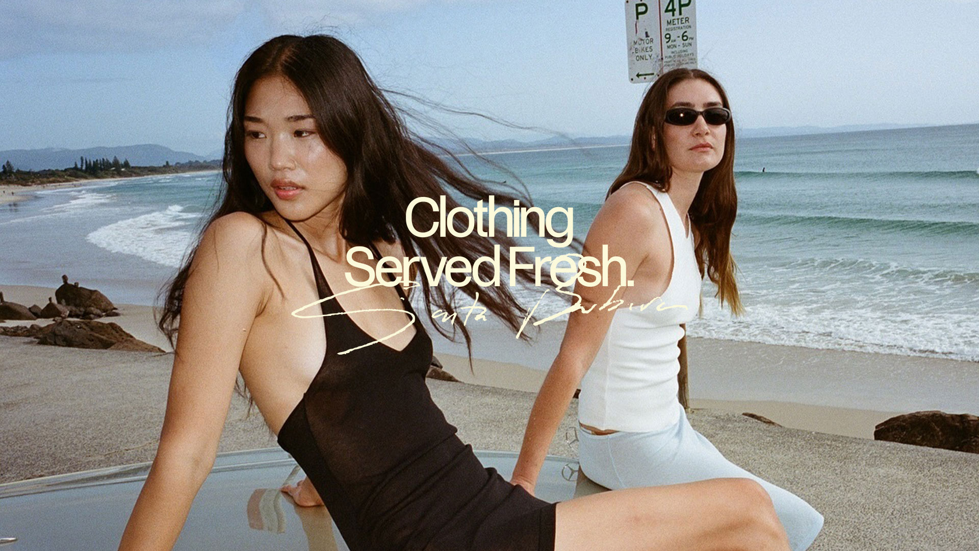
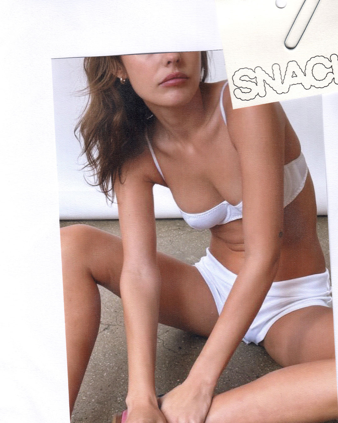
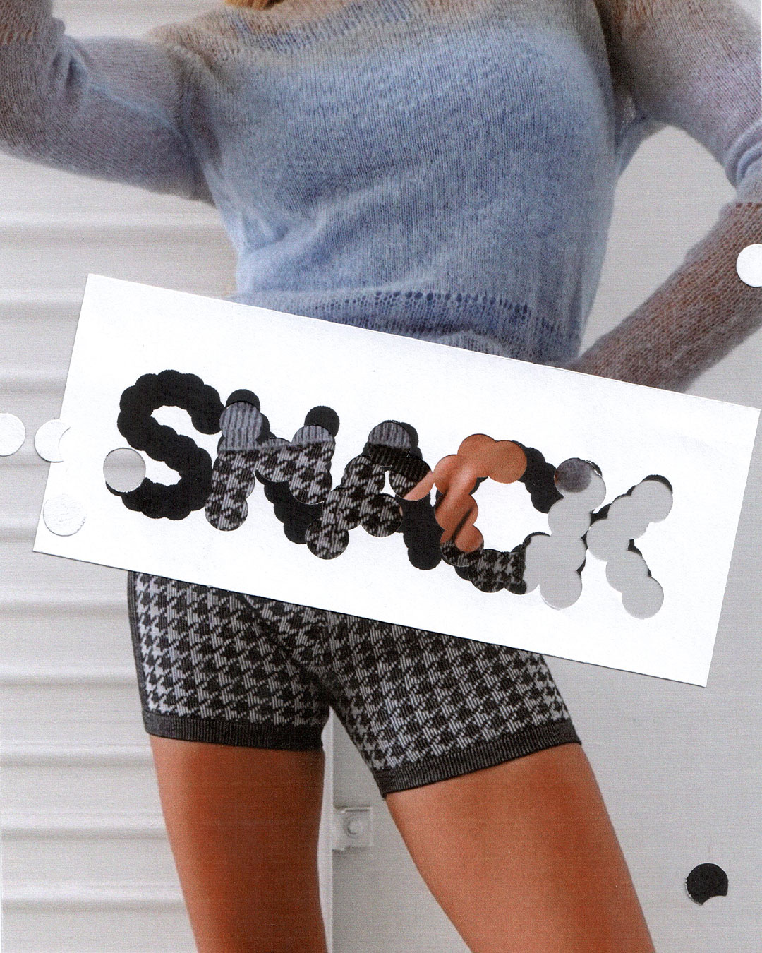
Snack posits shopping as a sensory experience. The thrill of discovery. The dopamine hit of putting together the perfect look. The name creates a tactile bridge between food and fashion — textures are savory, colors are juicy, and bold pieces are spicy.
It captures a kind of bite-sized luxury: intimate, indulgent, and singular.
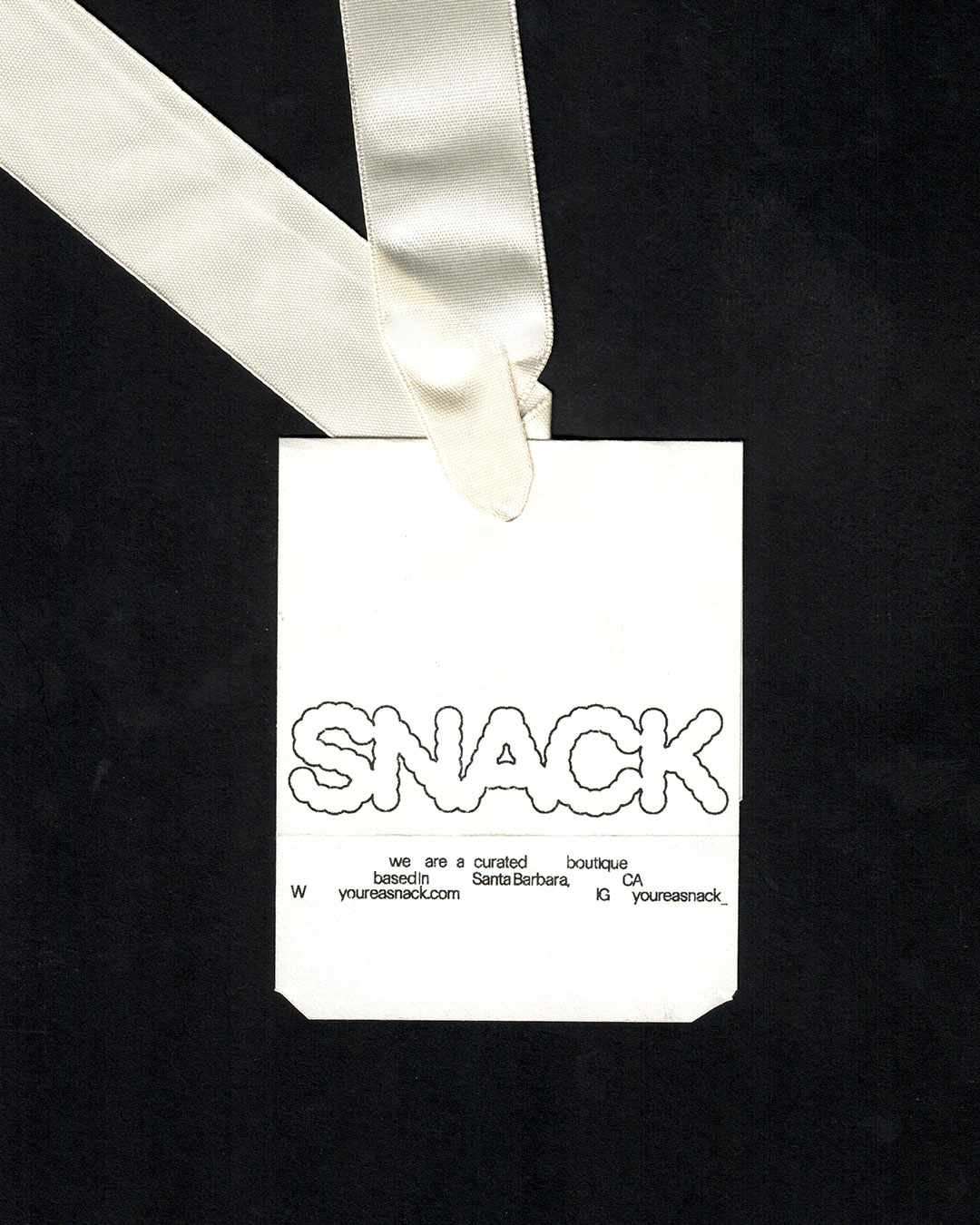

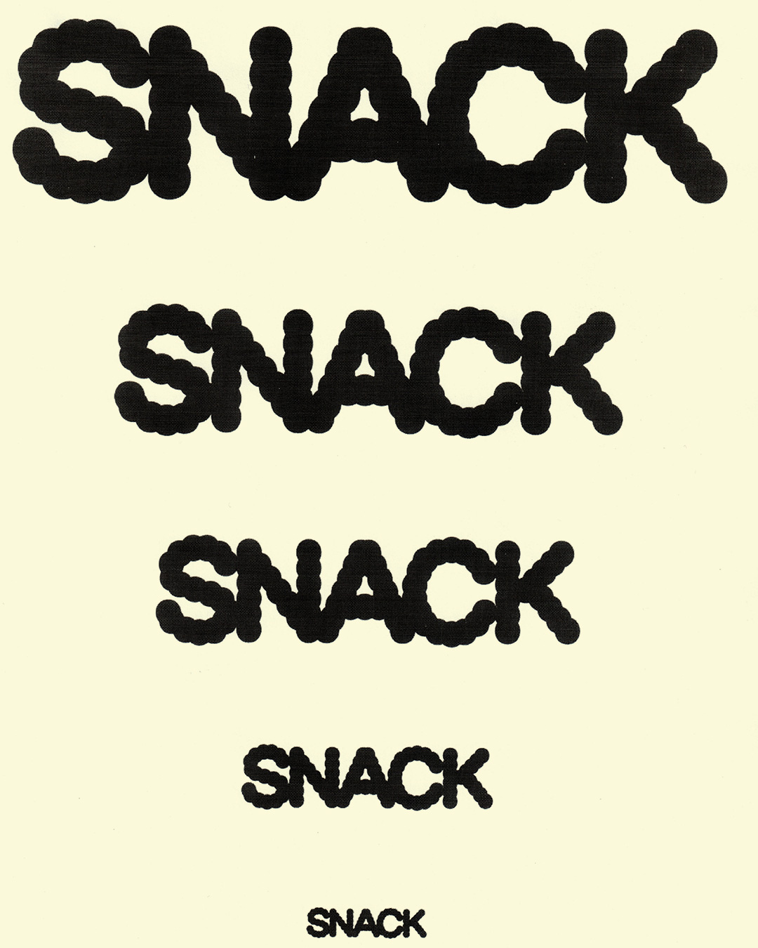
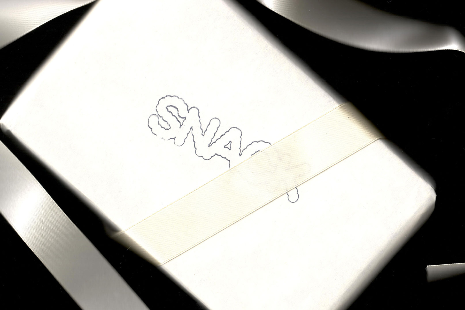
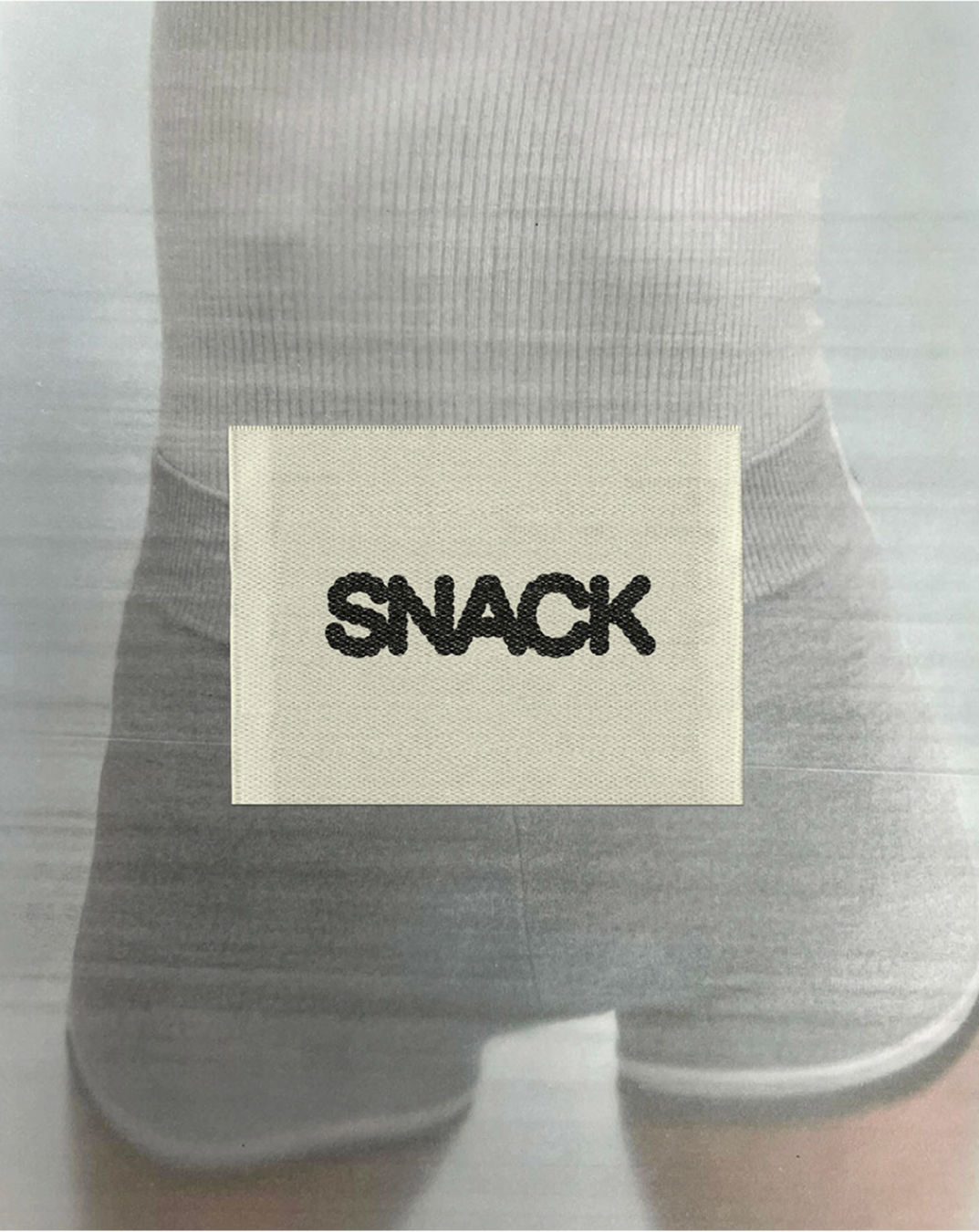
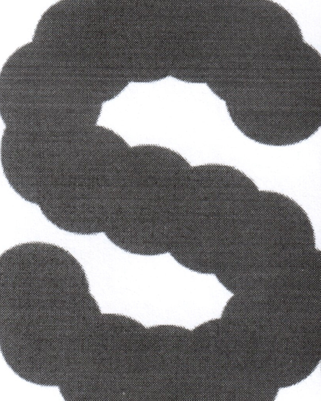
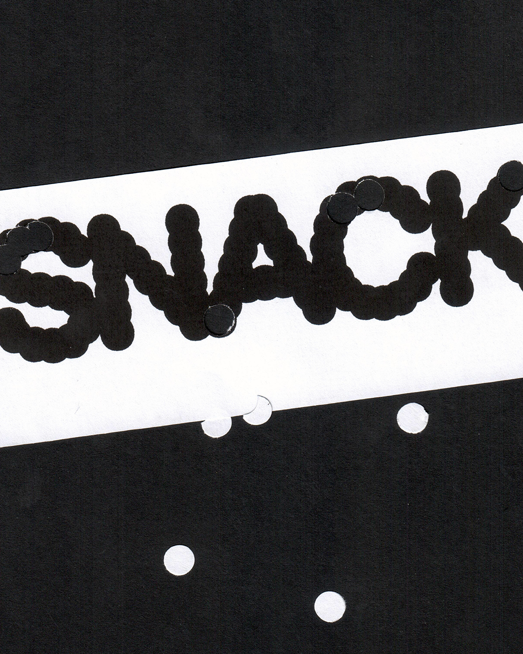
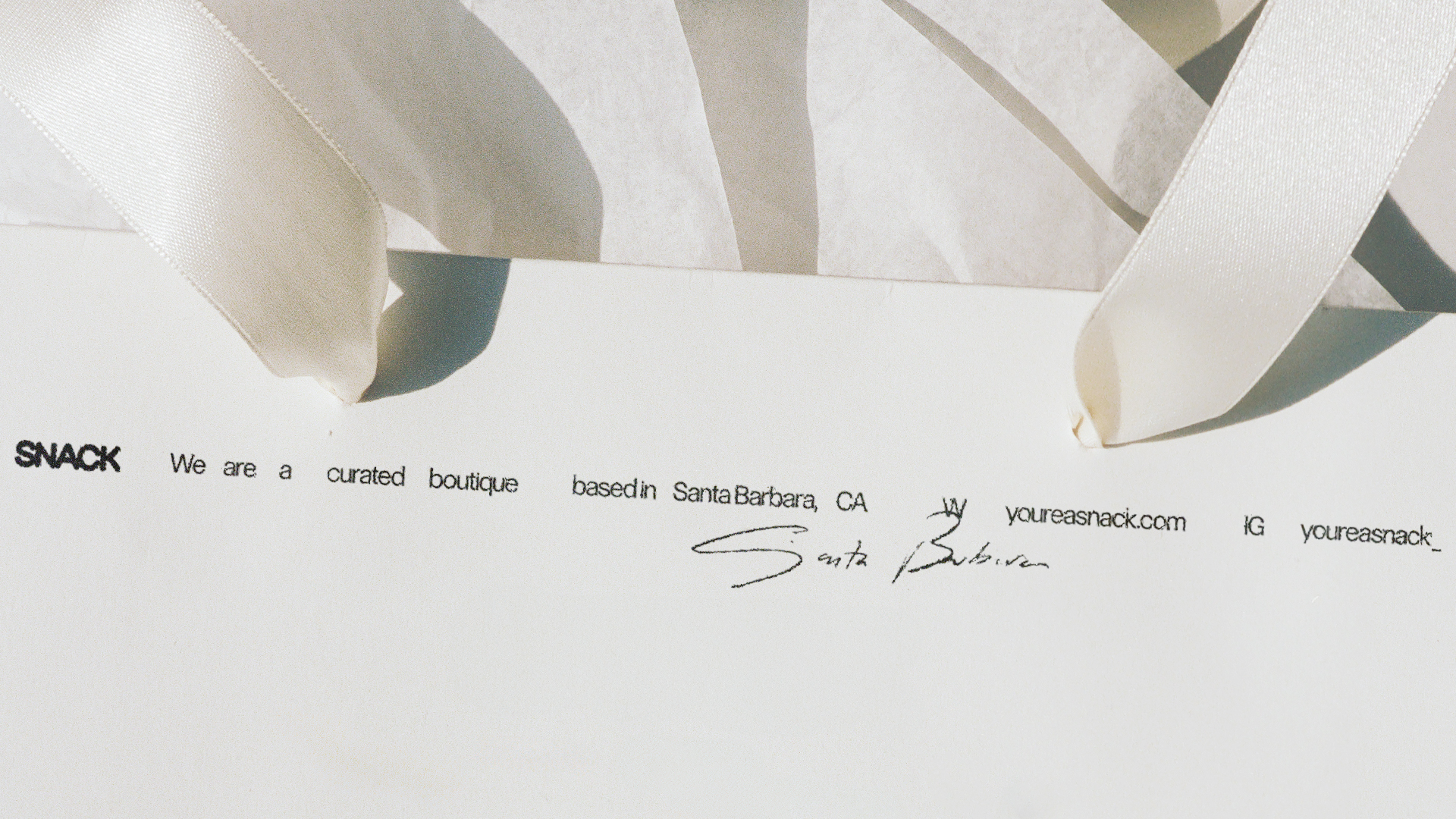
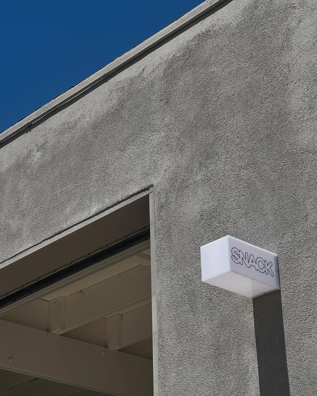
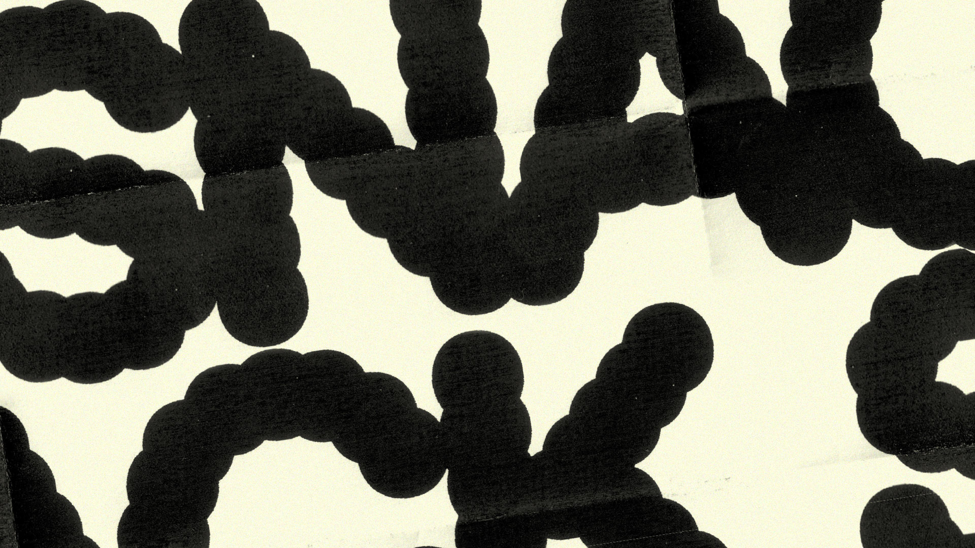
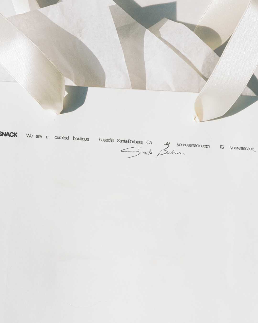
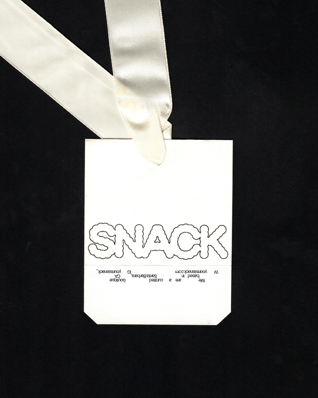
The identity is lead by an expressive logo that looks like you could bite into it. Commercial and iconic at first glance, yet sharpened by an experimental edge.
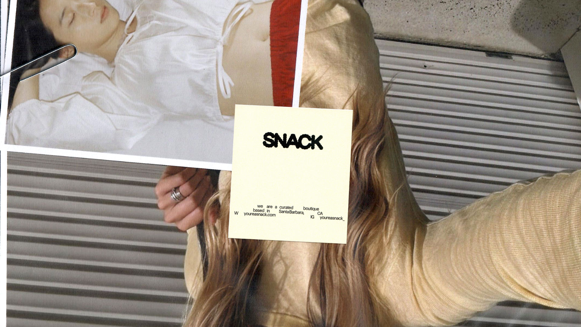
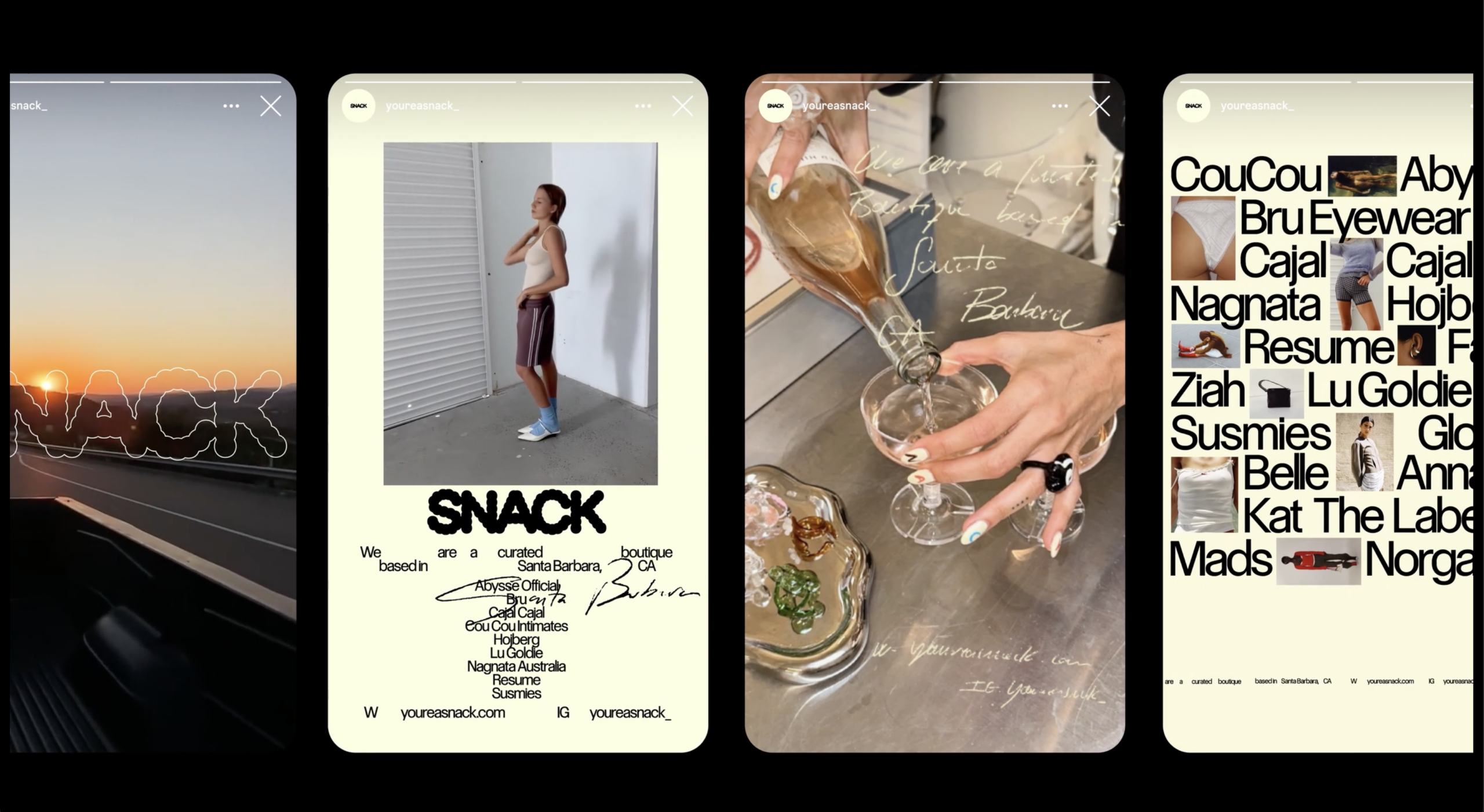
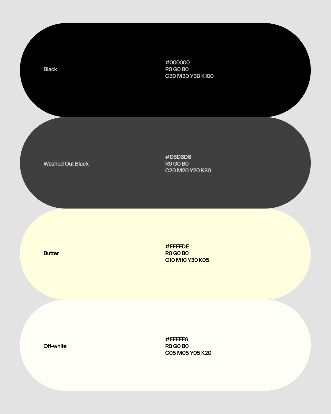
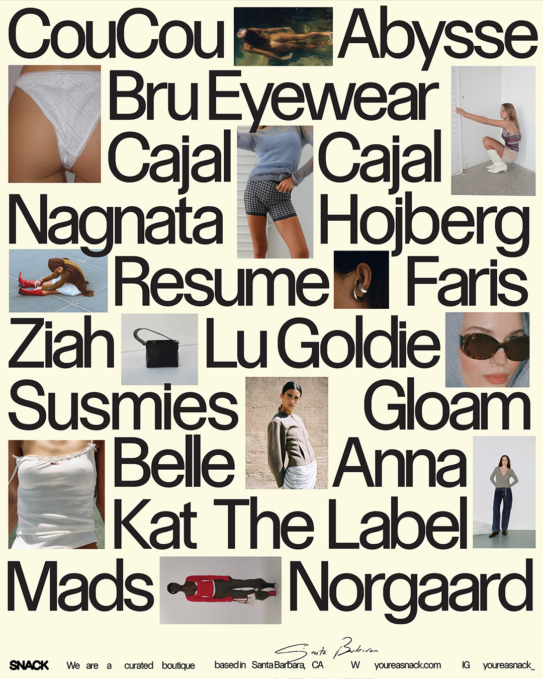
The broader design language embraces neutrality, drawing inspiration from the store’s brutalist interior. A restrained palette and minimal layouts step back, allowing the vibrant clothing and photography to take center stage. This approach delivers personality with subtlety.
A butter tone plays a key role throughout by amplifying the brand’s sensory cues, adding a layer of indulgence that feels utilitarian rather than decorative.
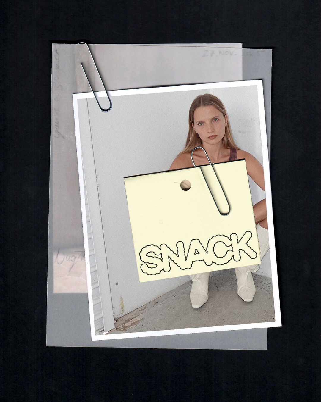
Print applications extend this balance of unfiltered energy and polish into the physical world. Raw textures meet elevated finishes. From packaging to ephemera, the tactile experience reinforces Snack’s point of view — luxurious without being precious.
BonTemps helped make sense of all my ideas. They took my big goals for Snack and turned them into a brand that feels confident and true to how we show up in the world.
It gave me total clarity. And honestly, it looks so good.
Founder & CEO, Snack
By speaking to both the refined tastes of Montecito Mummies and the creative energy of Santa Barbara’s local cultural class, we carved out a distinct, dynamic audience for Snack.
Through our engagement with Noa, we made instinct legible, and ownable.
Santa Barbara’s boutique shopping scene was overdue for a shake-up. Snack founder & CEO, Noa Wilde, came to us with an ambitious vision that at the time felt just beyond her grasp.
What was missing wasn’t taste or instinct, but clarity. Our work focused on surfacing the deeper ideas by naming the contradictions, defining her values, and turning intuition into a system she could lead with confidence.
Snack posits shopping as a sensory experience. The thrill of discovery. The dopamine hit of putting together the perfect look. The name creates a tactile bridge between food and fashion — textures are savory, colors are juicy, and bold pieces are spicy.
It captures a kind of bite-sized luxury: intimate, indulgent, and singular.

The identity is lead by an expressive logo that looks like you could almost bite into it. Commercial and iconic at first glance, yet sharpened by an experimental edge.
The broader design languages embraces neutrality, drawing inspiration from the store’s brutalist concept. A restrained palette and minimal layouts step back, allowing vibrant clothing and photography to take center stage.
This approach allowed us to deliver personality with subtlety.

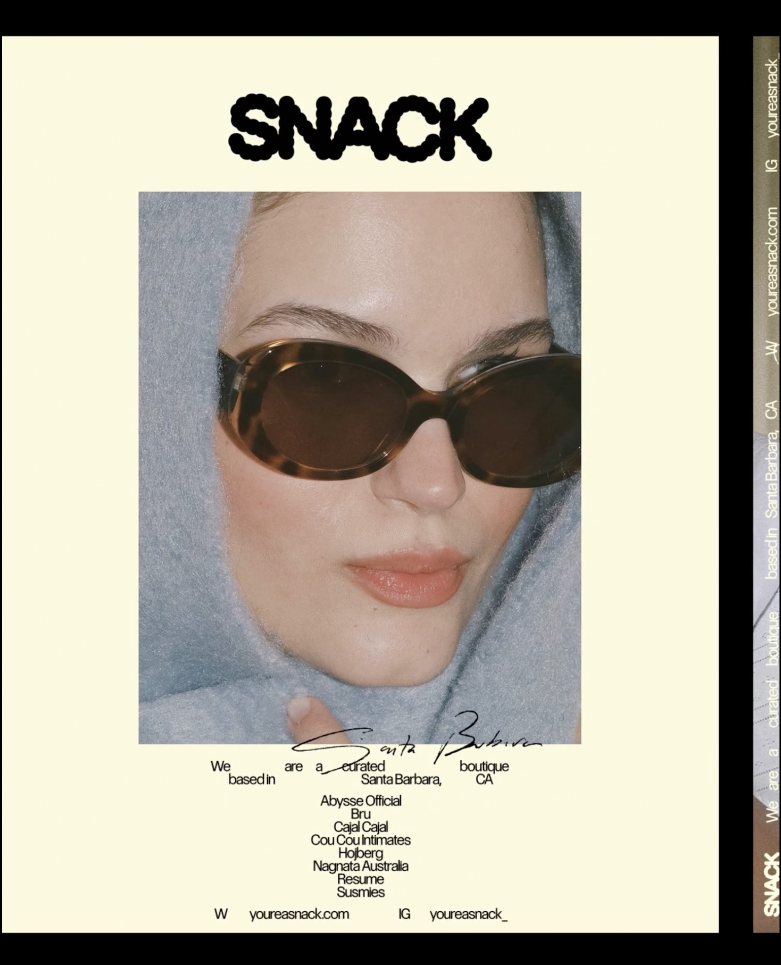
A butter tone plays a key role throughout by amplifying the brand’s sensory cues, adding a layer of indulgence that feels utilitarian rather than decorative.
Print applications extend this balance of unfiltered energy and polish into the physical world. Raw textures meet elevated finishes.
From packaging to ephemera, the tactile experience reinforces Snack’s point of view — luxurious without being precious.
BonTemps helped make sense of all my ideas. They took my big goals for Snack and turned them into a brand that feels clear, confident, and true to how we show up in the world.
It gave me total clarity. And honestly, it looks so good.
Founder & CEO, Snack
By speaking to both the refined tastes of Montecito Mummies and the creative energy of Santa Barbara’s local cultural class, we carved out a distinct, dyanmic audience for Snack.
Through our engagement with Noa, we made instinct legible, and ownable.